
How To Make A Tableau Treemap
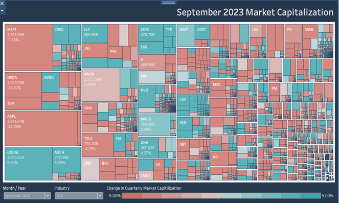
What Is A Tableau Treemap? A Tableau Treemap provides a powerful tool for visualizing hierarchical data in a nested format, where each branch of the tree is represented as a rectangle, and its size and color can vary to represent different data dimensions. Users can customize these maps with different colors, sizes, and labels to […]
How To Make A Tableau Sparkline Chart: Advanced Charting Made Easy
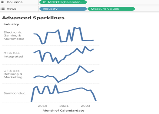
What Is A Tableau Sparkline Chart? A Tableau Sparkline Chart is a very small line chart, typically drawn without axes or coordinates. It presents the general shape of the variation (typically over time) in some measurement, such as temperature or stock market price, in a simple and highly condensed way. Let’s Make A Tableau Sparkline […]
How To Make An Amazing Tableau Trellis Chart
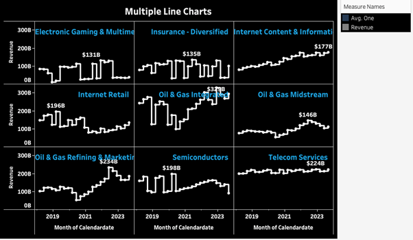
What is a Tableau Trellis Chart? A Tableau Trellis Chart also known as a Tableau Small Multiples Chart, is used for comparing multiple, different segments of data across the same scale and axes in a grid-like format. This type of Tableau visualization is useful for identifying patterns, trends, and anomalies across various sub-groups within a […]
How To Make A Speedy Tableau Race Bar Chart
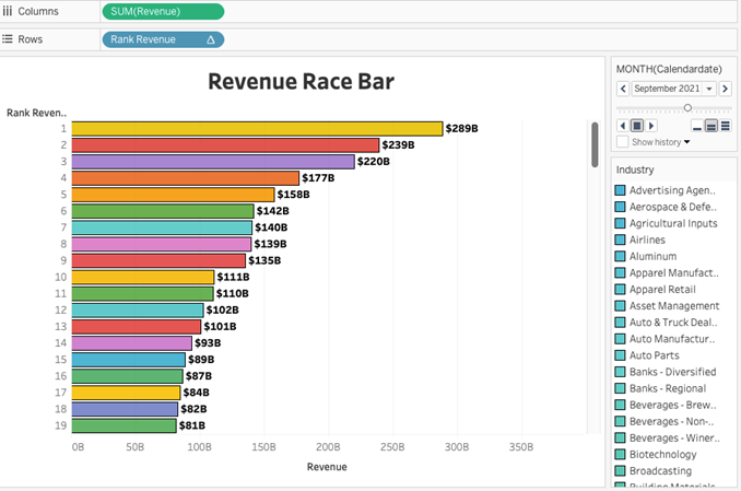
What is a Tableau Race Bar Chart? A Tableau Race Bar Chart is a visualization tool that makes data more engaging by turning it into an animated race. It works by showing bars representing different categories moving and changing in size over time. This dynamic display helps viewers easily follow changes in rankings and trends. […]
How to Make an Incredible Tableau Icicle Chart
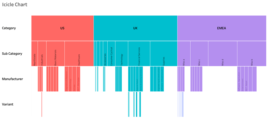
What is a Tableau Icicle Chart? What is a Tableau Icicle chart and why would we use it? An Icicle Chart is a way of displaying hierarchical data in an expanded format, without having overlapping and compressed marks. Icicle charts are not natively supported in Tableau’s standard chart types, but they can be created through […]
How to Make an Amazing Tableau Marimekko Chart
What is a Tableau Marimekko Chart? A Marimekko chart, also known as a Mekko chart or market map, is a type of visualization used primarily to display categorical data across two dimensions. In Tableau, a Marimekko chart combines aspects of a stacked bar chart and a 100% stacked bar chart but differs by varying both […]
How To Make A Tableau Curved Line Chart in 10 Minutes
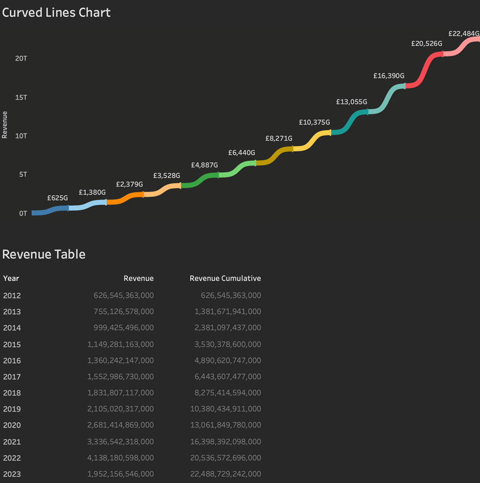
What is a Tableau Curved Line Chart? A Tableau Curved Line Chart is a variation of standard line charts. They look more interesting but the shape of the line can bit misleading as it suggests that the movement between the 2 points being plotted isn’t linear. Here is an example of a Tableau Curved Line […]
How to make a Tableau Radial Rounded Bar Chart
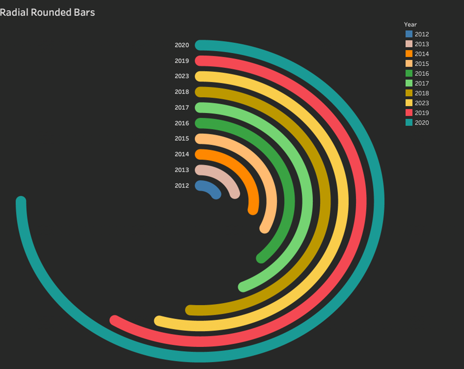
What is a Tableau Radial Rounded Bar Chart? A Tableau Radial Rounded Bar Chart is a standard rectangle bar chart variation. The bars are arranged radially instead of on a straight axis. A Tableau Radial Rounded Bar Chart is visually appealing and you can optionally use the line ends to emphasise the stat and the […]
How To Make A Tableau Coxcomb Polar Area Chart
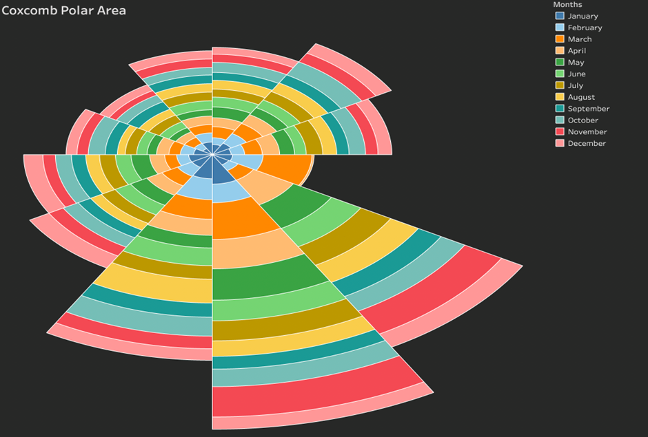
What is a Tableau Coxcomb Polar Area Chart? A Tableau Coxcomb Polar Area chart is a way of visually representing quantitative values across different dimensional segments. It is similar to a pie chart, but the Coxcomb indicates frequency by relative area, but it differs in its use of fixed angles and variable radii. The Tableau Coxcomb […]
How to make a Tableau Half Circle Timeline
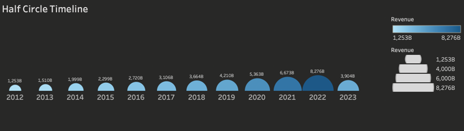
What is a Tableau Half Circle Timeline? A Tableau Half Circle timeline chart allows you to plot a measure along an axis using half circles to represent a measure. The flattened edge of the circle makes it easier to compare the relative value of one half-circle vs the relative value of another. What is a […]