What Is A Tableau Sparkline Chart?
A Tableau Sparkline Chart is a very small line chart, typically drawn without axes or coordinates. It presents the general shape of the variation (typically over time) in some measurement, such as temperature or stock market price, in a simple and highly condensed way.
Let’s Make A Tableau Sparkline Chart!
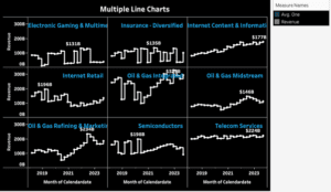
In this Tableau Sparkline Chart tutorial, we will delve into the fascinating world of revenue trends across four distinct industries. Our journey will encompass the Technology, Healthcare, Retail, and Energy sectors, exploring how each has evolved financially over time.
By dissecting and interpreting the intricate patterns of revenue flow, we aim to uncover the unique dynamics and challenges that characterize these industries. Join us as we unlock insights and understand the forces driving revenue trends in these critical sectors of our economy.
Let’s get started and create a sparkline graph step by step :
Step 1
Place ‘Measure Names’, then ‘Measure Values’ on your ‘Rows’ shelf.
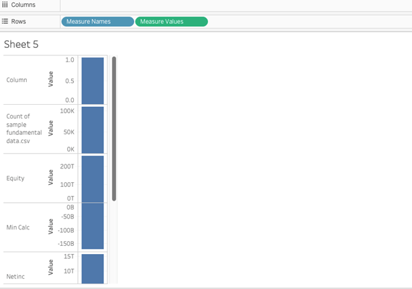
Notice that every measure name appears in your chart, whether it is relevant to your analysis or not – more on filtering out specific measure names later. Since you placed ‘Measure Values’ on your view as well, each measure name has an accompanying value, shown by default as a bar in each measure’s default aggregation (i.e. SUM, AVG, etc.).
I have also changed the view’s fit to “Fit Height” so that I can see all of the measure names and values without scrolling.
Step 2
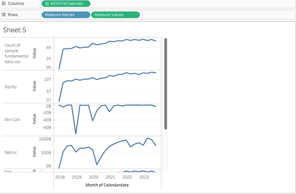
Place a date field on the ‘Columns’ shelf.
By right-clicking and dragging my ‘Calendardate’ field onto the ‘Columns’ shelf. The green indicates that the date will be continuous and the MONTH option means the date will be truncated at the monthly-level.
Step 3
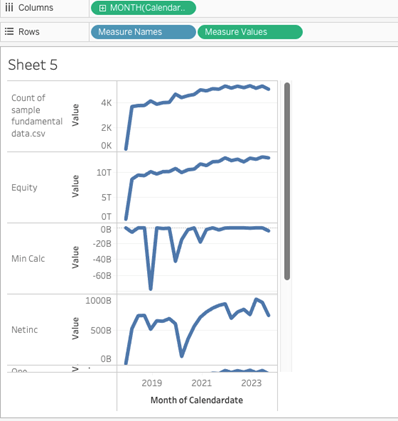
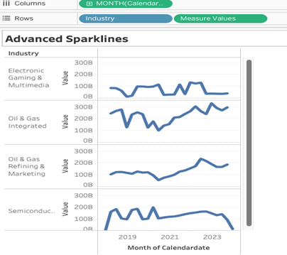
Reduce the width of the sparklines view to make the trends pop.
You can see at this point that the sparklines are coming together
Step 4
Remove irrelevant measures from your view.
We will remove everything and leave industry in measure name and revenue in measure values and we will be looking at around 4 different industries revenue over time in sparklines. We will replace measure names with industry. It will now look like this.
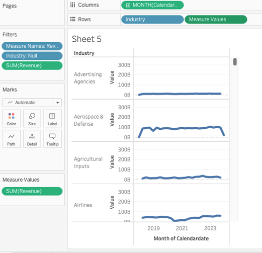
Now we have to filter and select only four industries that have higher revenue to see sparklines in action
Now the view is like this as above.
Step 5
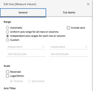
Exclude zero from your axes or remove measures that have little to no fluctuation.
To do this in Tableau, right-click on any of the axes in your sparklines and choose “Edit Axis”. You will see a box specifically created to give you the option to include or exclude zero in your axes. By default, the box to “Include zero” is checked. Select the independent axis range for each column and row and uncheck zero, now our view is like this
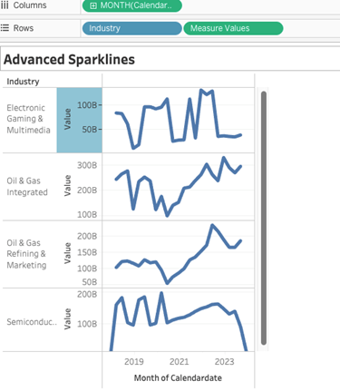
Now it’s looking like this:
Step 6
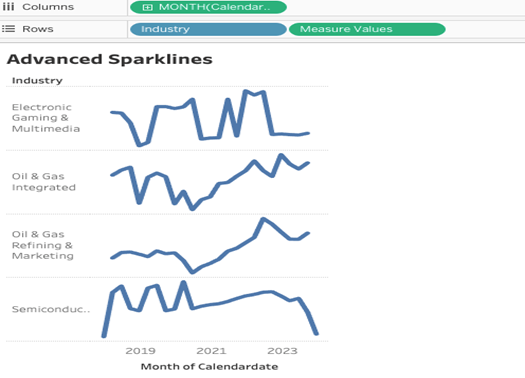
Hide axes and format your view.
And here we go sparklines are ready.

Congratulations! You’ve completed your Tableau Sparkline Chart!
Well done on completing your Tableau Sparkline Chart and learning a new Tableau skill to add to your knowledge! Hopefully, you can add this to your Tableau visualisation tools in the future and use your new skills for either clients or jobs.
For more on learning about how to create in Tableau, we invite you to head over to our blog. Learn more skills in Tableau and read up on all the latest information. For more on Tableau consulting to help your company deliver successful Tableau and data projects for finance, marketing and sales head over to our website and be sure to send us an email.