What is a Tableau Trellis Chart?
A Tableau Trellis Chart also known as a Tableau Small Multiples Chart, is used for comparing multiple, different segments of data across the same scale and axes in a grid-like format.
This type of Tableau visualization is useful for identifying patterns, trends, and anomalies across various sub-groups within a larger dataset.
By displaying the data segments side by side, the Tableau Trellis Chart allows viewers to easily compare and contrast different categories, regions, products, or periods of time without flipping between charts or graphs.
Let’s build a Tableau Trellis Chart!
Let’s get down to building our Tableau Small Multiples Chart or Tableau Trellis Chart, to visualize and compare! In this example, we will compare the revenue of 9 different industries.
By using this particular visualization technique in Tableau, we’ll create a grid of mini-charts, each representing the revenue trends within a specific industry.
This approach will allow us to conduct a detailed comparative analysis across these industries, highlighting unique trends, patterns, and anomalies in their revenue performance over time.
Our goal is to provide you with a clear understanding of how each industry stands relative to others and to uncover insights that might not be visible through traditional single-chart visualizations.
So let’s get to building our Tableau Trellis Chart and see our data come to life and shine.
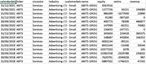
We will be using the following data:
Instructions
Step 1:
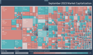
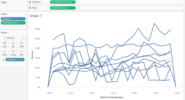
Create the visual by dragging the calendar date to columns (right-click and select the month calendar date and change it to continuous) and revenue on the row shelf. Bring industry on the details mark, and we need to make sure we select only 9 industries by the filter as shown in the picture at the start.
Your Tableau data should look like the example below:
Step 2:
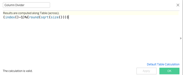
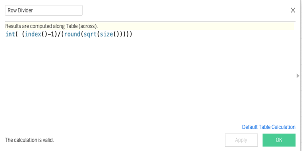
Create the following two calculated fields Row Divider and Column Divider.
Step 3:
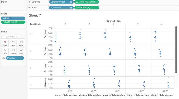
Convert both of these calculated fields to discrete and then drag the row divider to rows and column divider to columns.
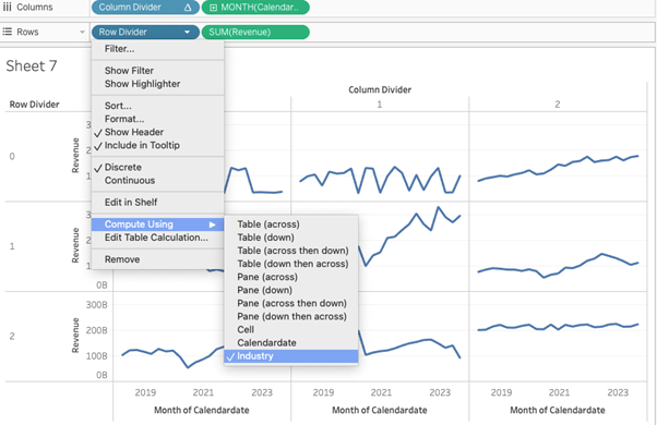
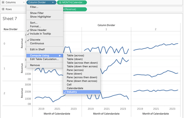
Step 4:
Right-click on these and compute them using the Industry
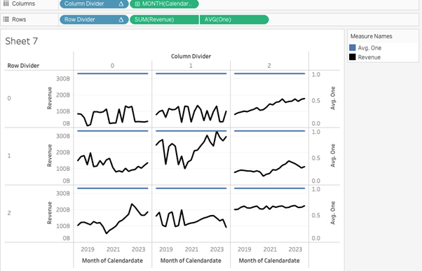
Step 5:
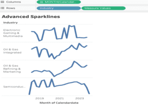
You can see your workbook divided into grids. Each grid will occupy one Industry as demonstrated in the example below:

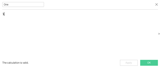
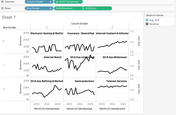
Step 6:
The next challenge that comes up is adding labels to these grids so that we can differentiate which grid belongs to which industry. To do that create a calculated field like in the example given below :
Step 7:
Drag the field on the rows after the revenue field and change the default aggregation of it to “avg”. Right-click on it and select dual axis. Your view should now be like the example below:
Step 8:
In the marks card for measure one, drag the industry from the detail to the text option and then change the opacity of the blue line to zero to make it invisible.
The final step is formatting your work to make it look great and easy to view for your client or for your portfolio.
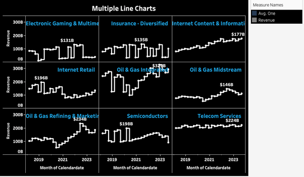
Congratulations! You’ve completed your Tableau Trellis Chart!
Well done on completing your Tableau Trellis Chart and learning a new Tableau skill to add to your knowledge! Hopefully, you can add this to your Tableau visualisation tools in the future and use your new skills for either clients or jobs.
For more on learning about how to create in Tableau, we invite you to head over to our blog. Learn more skills in Tableau and read up on all the latest information. For more on Tableau consulting to help your company deliver successful Tableau and data projects for finance, marketing and sales head over to our website and be sure to send us an email.