Table of Contents
What Is A Tableau Treemap?
A Tableau Treemap provides a powerful tool for visualizing hierarchical data in a nested format, where each branch of the tree is represented as a rectangle, and its size and color can vary to represent different data dimensions.
Users can customize these maps with different colors, sizes, and labels to uncover patterns and insights within complex datasets. By offering an intuitive and interactive way to display data, Tableau treemaps in Tableau help users quickly identify trends, anomalies, and relationships in their data, making them an essential tool for data analysis and decision-making.
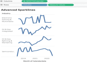
Here is an awesome example of a Tableau Treemap:
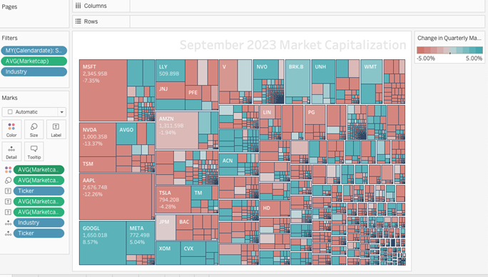
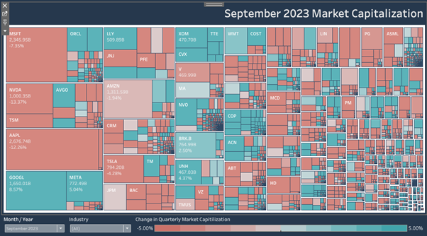
This is how a Tableau Treemap looks within a dashboard:
Let’s Make a Tableau Treemap!
In this tutorial, we will be delving into the analysis of average market capitalization and average market capitalization percentage by industry and ticker.
We’ll explore how to segment and compare these key financial metrics within different sectors, using a step-by-step approach to uncover insights and trends. By the end of this tutorial, you will have a clear understanding of how to leverage these metrics to gauge industry health and identify investment opportunities.
Our focus will be on practical application, ensuring you can apply these concepts directly to real-world data sets.
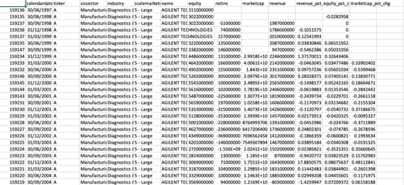
We will be using the following data given below:
Creating our Tableau Treemap
Step 1:
In the first step we will select marks to square, then we will drag Market cap pct change into colour, and market cap into the size we need to convert both measures to AVG and put a ticker into the label and it will create a tree map according to the following measures.
Step 2:
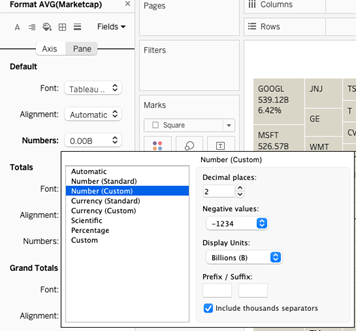
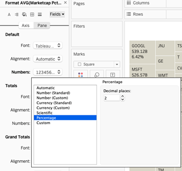
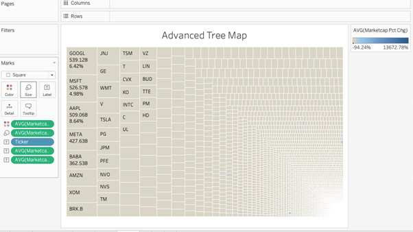
Now we need to put Avg market cap and Avg market cap pct change into the label also and then we will format it using percentages for pct change and numbers custom into billions for avg market cap and it will look like this
Change into billions number custom.
Change into percent.
Step 3:
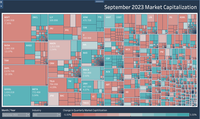
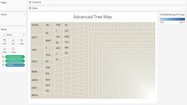
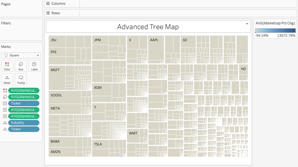
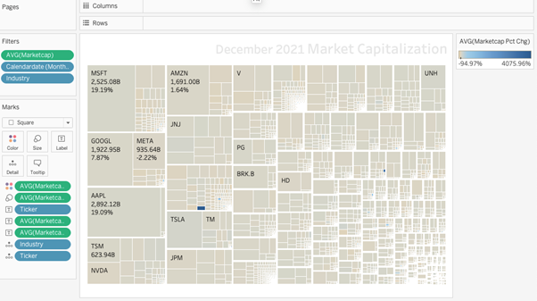
Now I will drag industry first and ticker second into detail in order to create blocks in a Tableau treemap for different industries representing the following ticker their avg market cap and their market cap pct change and it will look like this.
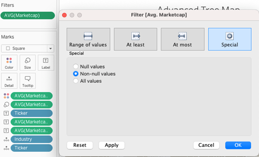
Step 4:
We need to put avg of the market cap into the filter and select non-null values
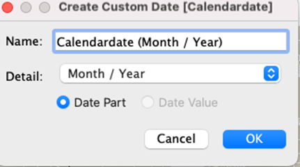
Now after that, the data needs to be converted into custom data.
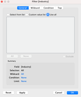
We also need to put the industry into the filter and select all values.
Now after, put all these into filters, the worksheet will look like this:
Step 5:
Now we need to do a little formatting and change the color of avg market cap pct and also the values of the legend.
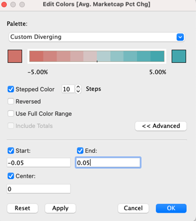
Color codes used for -5.00% = D2726c
Color codes used for 5.00% = 37A6AC
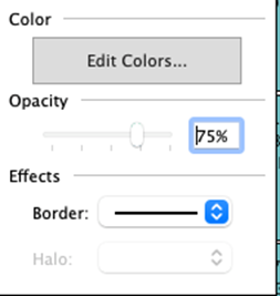
Border and opacity have been used.
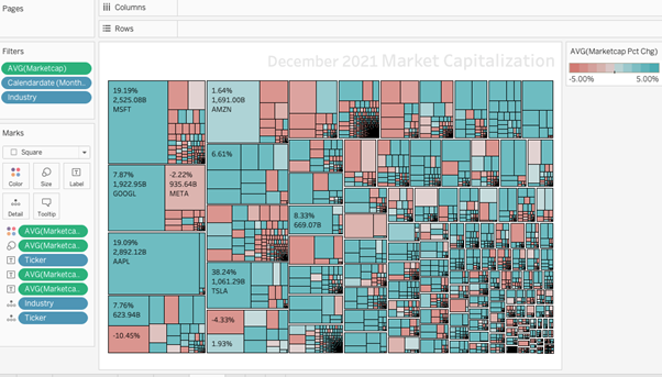
After the following formatting, it looks like this:
Now we will set this sheet within the dashboard with 2 filters of the date that we have created.
We have 2 filters in the filters shelf of calendar date and industry so we will use both in the dashboard. The finished product should look like this!
Congratulations! You’ve completed your Tableau Treemap!
Well done on completing your Tableau treemap and learning a new Tableau skill to add to your knowledge! Hopefully, you can add this to your Tableau visualization tools in the future and use your new skills for either clients or jobs.
For more on learning about how to create in Tableau, we invite you to head over to our blog. Learn more skills in Tableau and read up on all the latest information. For more on Tableau consulting to help your company deliver successful Tableau and data projects for finance, marketing and sales head over to our website and be sure to send us an email.