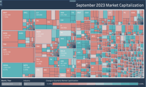
What is a Tableau Icicle Chart?
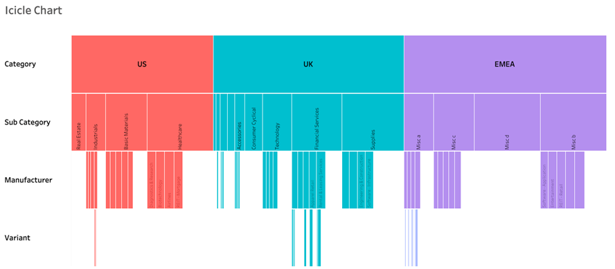
What is a Tableau Icicle chart and why would we use it? An Icicle Chart is a way of displaying hierarchical data in an expanded format, without having overlapping and compressed marks.
Icicle charts are not natively supported in Tableau’s standard chart types, but they can be created through a combination of techniques.
There are a few ways to achieve the output displayed in your Icicle chart. The first way is that you can use your data densification to create levels in the underlying data source. This takes a little time, and is more inflexible, but makes the chart build a little easier.
The other option is that you can use multiple segregated charts and fit them together. This second option is the one we will build today. Follow the instructions and have your icicle chart built in no time!
Here is our Tableau Workbook Example
Steps to Create A Tableau Icicle Chart
- Connect to your data source and locate the dimensions and measures that are needed to build your base visualisation. For an icicle chart, you’ll need dimensions in a hierarchy along with a measure to analyse the hierarchy sections.
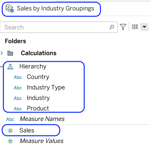
We’re using a country/product for the dimension and a measure called sales for the measure. If you need to create the hierarchy drag one dimension on top of the other and re-organise into the logical levels
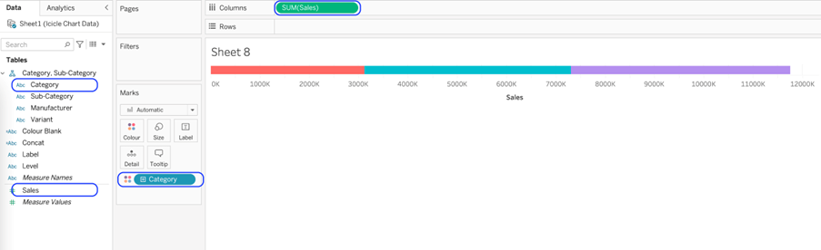
So the first step is that we will create the top level of the icicle. After that, create a new sheet and place Sales on columns and Category on colour.
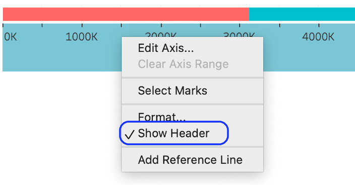
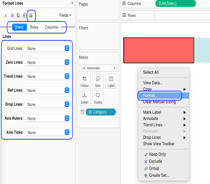
Now Right-click on the axis and hide the header.
Make the bar taller and remove the gridlines.
Now that the bar is clean of unwanted marks, we can start to add some context to our chart.
We can do this by adding a text header by typing the name in ‘ ‘ in rows.
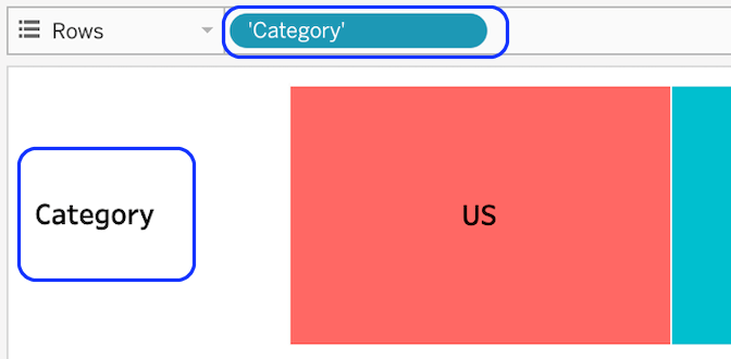
From here let us add on the top-level category object to labels and format as desired.
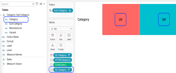
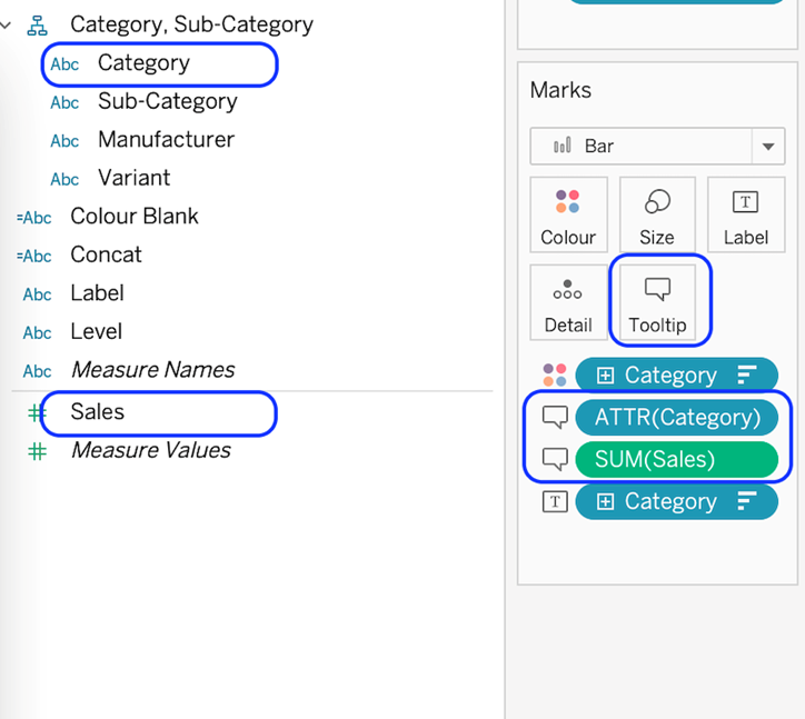
Add the Category to tooltips.
Now we can create the next level down, Sub-Category. The steps are almost the same as the top level. I won’t repeat them here, instead I will show the differences.
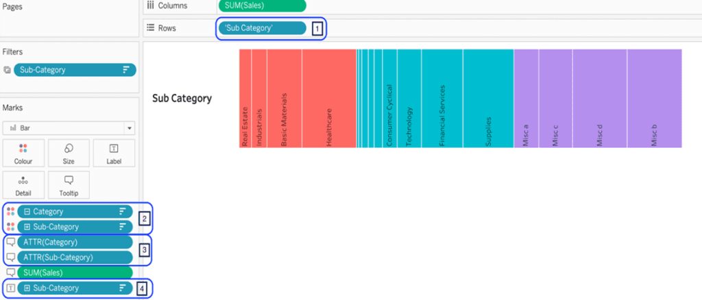
The bar label is now ‘Sub-Category’.The sub-category is added to the colour.
The subcategory is added to the tooltip.
The subcategory replaced the category on the label.
The 3rd level.
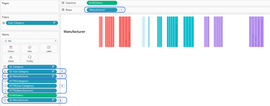
- The bar label is now ‘Manufacturer.
- The subcategory is added to the details shelf.
- The manufacturer is added to the colour.
- The manufacturer is added to the tooltip.
- The manufacturer replaced the category on the label.
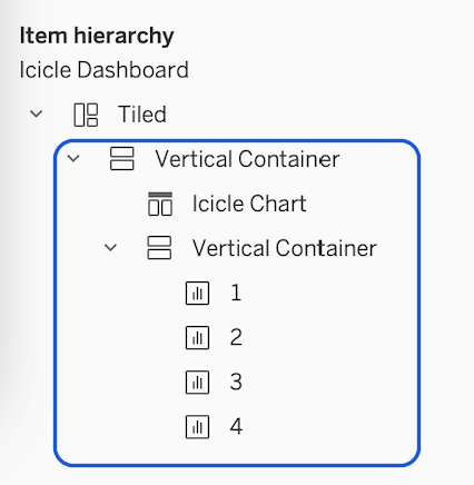
- The 4th level onwards is just replications of the 3rd. Add as many levels as are needed.
- When each level in the hierarchy is completed add each worksheet into a dashboard inside a vertical container.
For the final touch now just adjust your colours, backgrounds and bar sizes as you like to finish your chat and voila you are done in record time.
Congratulations! You’ve completed your Tableau Icicle Chart!
Well done on completing your Tableau icicle Chart and learning a new Tableau skill to add to your knowledge! Hopefully, you can add this to your Tableau visualisation tools in the future and use your new skills for either clients or jobs.
For more on learning about how to create in Tableau, we invite you to head over to our blog. Learn more skills in Tableau and read up on all the latest information. For more on Tableau consulting to help your company deliver successful Tableau and data projects for finance, marketing and sales head over to our website and be sure to send us an email.