Access 550+ data and AI courses, learning tracks, and certifications. Grab your 50% discount now and start learning like a pro!
👋 Hi, I’m Simon Jeffery
Senior Data Consultant | 12+ Years Experience
I help businesses unlock insights, streamline reporting, and deliver real business outcomes through data. 📈 From dashboards to strategy, I’m here to help. 🤝 Let’s Connect
Want to chat? Choose what works best for you:
Master data analysis with hands-on courses from DataCamp. Learn at your own pace and join 1M+ learners worldwide. Start now!
About Us
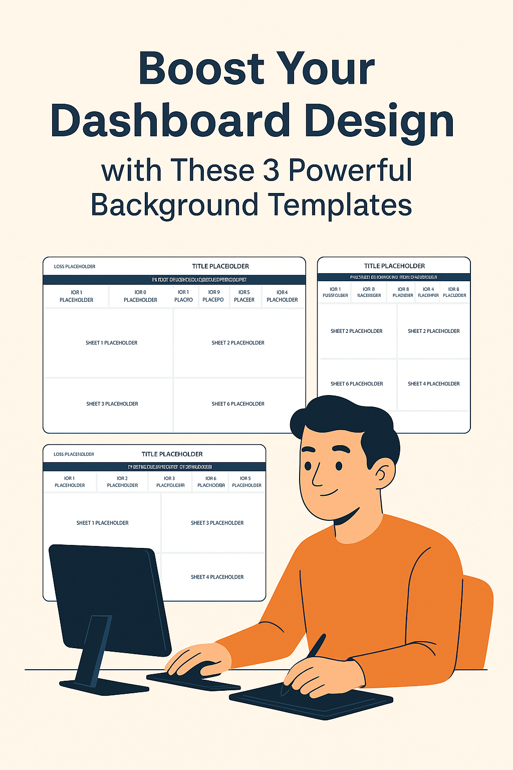
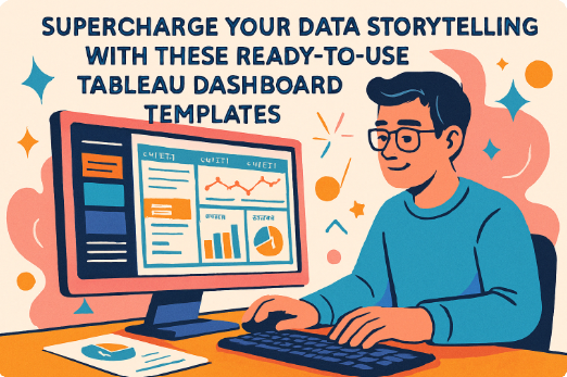
Welcome to our Tableau Consulting Services. We specialize in helping businesses optimize their data analysis and decision-making capabilities using Tableau.