Creating insightful visualizations from your data can unveil trends, patterns, and anomalies that might go unnoticed. Tableau, a leading platform for data visualization, enables users to transform raw data into compelling and interactive visual stories. The time series chart is one of the most valuable types of data visualization, especially when analyzing data over time. Time series charts are essential for understanding how values change over periods and can be instrumental in forecasting future trends, analyzing past performance, or spotting cyclical behaviors.
In this blog, we will delve into the various ways to conduct time series analysis in Tableau, showcasing the platform’s versatility and ease of use for beginners and advanced users. Whether you aim to display sales figures over the fiscal year, website traffic throughout the months, or any other time-sensitive data, Tableau provides many options to convey your data effectively. These charts are from Tableau public, we do not take credit for creating these charts.
Table of Contents
We’ll begin by discussing the basics of time series in Tableau and why it’s crucial for data analysis. We’ll provide step-by-step guides on creating simple line charts and advancing to more complex visualizations like moving averages and forecasting models. Additionally, we will explore how to customize your charts with Tableau’s rich features to make your data stand out. From adjusting date granularities to incorporating interactive dashboard elements, you’ll discover how to tailor your visualizations to meet your needs.
By the end of this blog, you’ll gain a comprehensive understanding of the different methodologies for crafting time series visualizations in Tableau, enabling you to leverage your data for insightful, impactful decision-making. Whether for business intelligence, academic research, or personal projects, mastering the Tableau time series chart and learning how to create time series analysis in Tableau can significantly enhance your data storytelling capabilities. Let’s embark on this visual journey and unlock the full potential of your data with Tableau time series visualizations.
1. Tableau Stacked Bar Chart
This chart is a stacked bar chart representing the percentage of a total value broken down into categories over a certain period. Each bar represents a month, as indicated by the labels ‘Jan’, ‘Feb’, ‘Mar’, and so on. The years 2016 and 2017 are also marked, showing two years. The bars are segmented into different colours, each representing a category or a part of the whole for that specific month.
This type of visualization helps compare the composition of a metric across different periods. It allows an analyst to see the total value for each month and how the proportions of the constituent parts change over time. This can be particularly valuable in identifying trends or patterns in the data, such as seasonal effects, growth or decline in specific categories, or shifts in the total composition.
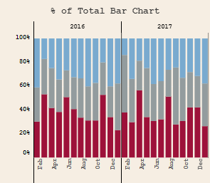
For instance, one might use such a chart to track the percentage sales of different product categories over time, the monthly distribution of website traffic by source, or any other metric where understanding the relative proportions is as important as the absolute numbers. It’s a powerful tool in many analytical contexts where the relationship between parts and the whole can offer deeper insights into the data.
2.Tableau Stacked Area Chart
This Tableau time series chart is a stacked area chart showcases quantitative data across time. Each colored layer of the chart corresponds to a distinct category, with the chart breaking down the aggregate data into these categories. The vertical axis, ranging from ‘0K’ to ‘100K’, likely represents a numerical metric such as sales, users, or revenue. The horizontal axis chronologically traces the data from 2016 to 2018, making it straightforward to conduct time series analysis in Tableau.
Stacked area charts like this one are invaluable for conducting a tableau time series analysis, as they illuminate the overall trend of the data and the relative contribution of each category over time. This type of visualization in Tableau allows analysts to see how individual segments ebb and flow in the total context.
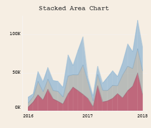
Employing this Tableau time series chart is advantageous for discerning the cumulative impact of different data segments and understanding their relationship as part of the total over a timeline. It can reveal how particular categories influence the overarching trend, crucial for detecting long-term shifts that might not be immediately apparent when categories are viewed separately. For example, when creating a Tableau time series to track growth in business sales, this chart could illustrate the contributions from various product lines or services to the overall sales volume.
3.Tableau Percentage of Total Area Chart
This Tableau time series chart is a percentage of the total area chart, a specific kind of Tableau time series visualization that illustrates the proportional contributions of various data categories over time. The vertical axis of this chart indicates percentage values from 0% to 100%, while the horizontal axis tracks time from 2016 to 2018. The distinct colors or shades layered over one another denote different categories, each contributing to the cumulative total at each time point.
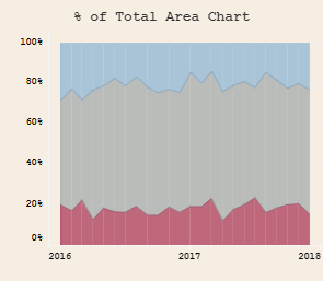
Employing this type of visualization is pivotal for time series analysis in Tableau, as it decodes how the relative contributions of distinct categories evolve. By expressing data in terms of percentages of a whole, this Tableau time series chart is particularly beneficial for contrasting the distribution patterns among categories, focusing on their relative, rather than absolute, magnitudes. Such a chart excels in signaling proportional shifts — for instance, detecting an ascending or descending trend in product market share or demographic changes within a population across years. It is instrumental in unveiling patterns not readily observable through mere numerical data, especially within complex datasets where the overarching total remains unchanged while the internal configuration varies, a common scenario in the time series analysis Tableau.
4. Tableau Bar Chart vs Reference Line
This Tableau time series chart is a bar chart with a reference line that showcases monthly data points across a year. Each bar denotes a month, from January to December, and the height of each bar indicates the data’s value or quantity measured for that month. The color-coding of the bars may distinguish between categories or quarters, adding clarity to the time series in Tableau.
The reference line across the bars establishes a standard for time series analysis in Tableau, allowing for a direct comparison with the monthly figures. This line could symbolize an average, a target, a threshold, or a critical level pertinent to the dataset.
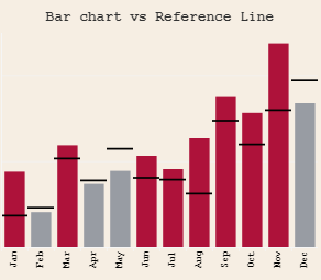
Utilizing this tableau time series chart efficiently pinpoints which months exceeded or fell short of a specific benchmark. It’s ideal for conducting a time series analysis Tableau to monitor sales relative to targets, manage expenses against budget constraints, or track any metric against an established norm. Providing a stark visual cue aids stakeholders in evaluating performance and making informed decisions. For those learning to Tableau create time series, this chart exemplifies a practical application of visual analytics.
5. Tableau Dual Axis Bar Chart / Line Chart
This Tableau time series chart is a dual-axis chart that combines a bar graph and a line graph to display two distinct measures within the same timeframe. The left vertical axis, labelled from 0 to 300K, likely tracks sales figures, with each bar representing the monthly sales from January to December. The right vertical axis, with a scale from 0 to 40K, presumably corresponds to profit, with the line graph charting the profit for each month.
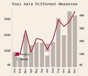
Dual-axis charts are handy for time series analysis in Tableau, particularly when comparing two related yet differently scaled measures, such as sales and profit. This Tableau creates a time series feature that allows a simultaneous view of how one measure may impact the other. It’s invaluable for identifying patterns and outliers in both data sets over the same period. For example, it might reveal whether a surge in sales aligns with an uptick in profit or if profit margins vary independently of sales volume, offering critical insights for strategic business analysis and decision-making.
6. Tableau Bar in Bar Chart
This Tableau time series chart is a ‘Bar in Bar’ chart, enabling a comparison of two categories within the same visual element. It displays two data sets for each month, from January through December, comparing ‘This Year’ to ‘Prev Year’, as the legend suggests. In this Tableau, created time series, the ‘This Year’ bars are superimposed over the ‘Prev Year’ bars for a clear month-to-month comparison.
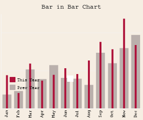
This type of Tableau time series visualization is beneficial for conducting time series analysis Tableau, as it delineates the comparison between two related data sets. It is adept at demonstrating growth or decline, facilitating easy identification of trends and performance assessment over time. These Tableau time series charts are frequently utilized in business scenarios to compare annual sales, productivity, or other crucial metrics, offering stakeholders an immediate visual comparison of year-over-year data.
7. Tableau Variance to Overall Average
This Tableau time series chart is a variance to an overall average bar chart, highlighting deviations from an established average. The vertical axis quantifies the variance, with positive figures above zero for values exceeding the average and negative figures below for those falling short. The horizontal axis, segmented by time, spans two distinct years: 2016 and 2017.
In this time series in Tableau, upward-extending bars denote values surpassing the average, while downward bars reflect sub-average values. The color scheme—typically red for negative variance and blue or grey for positive variance—offers a clear visual indicator to swiftly evaluate performance relative to the average.
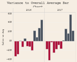
Such a Tableau time series chart is exceedingly helpful for immediate visual data analysis against a benchmark, here being the overall average. It’s crucial for time series analysis Tableau, especially for detecting outliers, evaluating consistency, and recognizing periods of over- or underperformance. For instance, in the financial time series analysis in Tableau, this chart type can illustrate monthly revenue fluctuations compared to a yearly average, enabling businesses to identify sectors that need intervention or successful strategies promptly.
8. Tableau Spark Bars
This Tableau time series chart, or Spark bars, is a streamlined bar chart variant frequently utilized in dashboards and reports for swift trend or variation analysis within a dataset. It displays horizontal bars across different categories—’Art’, ‘Storage’, ‘Supplies’, and ‘Tables’. Each row signifies a category with a sequence of bars along it, representing values across a time series in Tableau or against various subcategories.
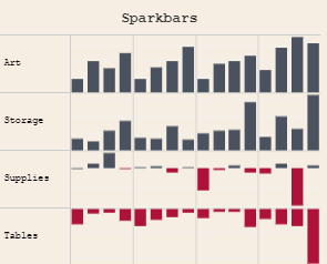
Spark bars are invaluable in time series analysis in Tableau as they offer a succinct summary of data trends and comparative analyses without the detailed axes or legends typically found in more complex charts. They shine in scenarios where conserving space is crucial, such as executive summaries or dashboard widgets demanding a concise data overview, for those aiming to Tableau create time series, Spark bars aid in swiftly gauging the performance or status across various categories, discerning growth or decline, and fostering data-driven decision-making with their visual conciseness.
9. Tableau Difference from Previous
This Tableau time series chart, labelled “Difference From Previous,” displays a dataset’s year-over-year change or delta. The bars visualize the extent of change—upward bars for positive and downward for negative shifts, with grey indicating positive and red marking negative changes. The timeline covers three consecutive years, 2016 through 2018, indicating annual data points.
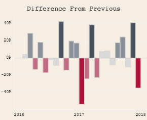
Such a Tableau time series chart is crucial for conducting time series analysis in Tableau, as it swiftly pinpoints trends or variances over time. This is particularly advantageous in contexts such as financial time series analysis Tableau, inventory control, or any analysis where tracking the difference from one period to another is pivotal. Highlighting the variances rather than the aggregate figures streamlines the process of evaluating the impact of specific events or actions across different periods within the time series in Tableau.
10. Tableau Calendar Heatmap
The image displays a Tableau time series chart as a calendar heatmap. This visualization utilizes color gradients within a calendar layout to depict varying data point levels. Each square signifies a day, arranged by the week, Sunday through Saturday. The saturation of each square’s hue corresponds to the data’s value for that day in Tableau, with deeper colors indicating higher metrics.
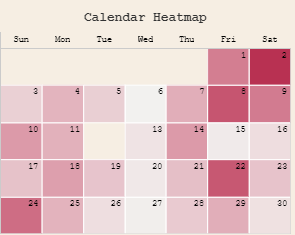
Such a Tableau time series chart is pivotal for time series analysis in Tableau, especially for observing daily patterns or trends. It’s advantageous for tracking metrics like website traffic, sales figures, or user engagement within Tableau time series analysis. The heatmap format promptly highlights which days experience peaks or troughs in activity, facilitating a week-over-week comparative analysis and spotlighting potential cyclic behavior. For businesses looking to Tableau create time series, it can reveal, for example, if weekends draw more user activity compared to weekdays or if specific events trigger notable data variances.
11. Tableau Butterfly Chart
The image shows a Tableau time series chart, known as a butterfly chart, which is an effectual bar chart for comparative analysis in Tableau. The bars branch out from the central axis at ‘0’, horizontally aligned across months from January to December. For each month, dual bars extend in opposite directions, with the potential representation of ‘This Year’ and ‘Prev Year’ data, as the legend indicates.
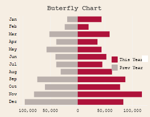
This Tableau time series chart is instrumental for time series analysis in Tableau, offering an immediate side-by-side comparison of two datasets. It is particularly adept at visually delineating the variance between values month-by-month. Within the Tableau time series analysis scope, this chart type can juxtapose various financial metrics, such as monthly sales or expenses, across consecutive years. The chart’s symmetry aids in quickly identifying which months exhibited higher or lower figures compared to the previous year, thereby streamlining the assessment of temporal trends, consistencies, or discrepancies.
12. Tableau Sparklines
The dashboard section depicted here utilizes sparklines, a form of Tableau time series chart, to succinctly present trends within various product sub-categories, including Accessories, Appliances, Art, and Binders. These charts excel in time series analysis in Tableau, efficiently highlighting the upward and downward performance trajectories over time without the clutter of axes.
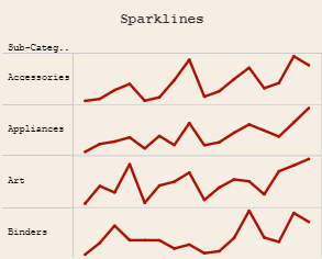
Utilized within a Tableau to create a time series context, sparklines offer a streamlined visual summary, ideal for comparing the time series in Tableau across different data sequences. The minimal design is beneficial for executive dashboards or reports where a quick understanding of the time series analysis Tableau is needed, and the overall movement is more significant than granular data points.
13. Tableau Slope Graph
The image illustrates a Tableau time series chart known as a slope graph, adept at comparing values over a duration, evident from the 2016 to 2017 data points on the horizontal axis. Each line embodies a distinct segment, with its inception at the graph’s left correlating to the 2016 value, culminating at the right with its 2017 counterpart. The vertical axis, marked from 0 to 100%, quantifies percentage changes, underscoring the Tableau time series analysis’ capacity to reflect normalized data.
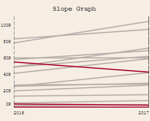
In the realm of time series analysis in Tableau, such slope graphs are pivotal as they distinctly depict the trend’s trajectory and intensity across intervals. For multiple items, as showcased, they streamline the comparison process, bolstering the time series analysis Tableau by delineating which categories have ascended or descended. The inclination of each line—upward indicating growth, downward a decline—reveals the extent of change, a core principle in time series in Tableau.
Red-highlighted lines in this Tableau create a time series visualization that signals specific categories of note, perhaps the most drastic shifts, either positive or negative. This strategic emphasis efficiently navigates the observer to paramount transitions, sparing them the complexity of less impactful data.
14. Tableau Cycle Plot
The image presents a Tableau time series chart known as a cycle plot, an insightful tool for delving into trends and patterns that unfold over time within seasonal or cyclical datasets. This Tableau time series plot dissects data into distinct periods, fostering the analysis of comparable intervals. Here, it compares monthly data from January to June across multiple years—2015 to 2017.
Each vertical cluster of markers and lines likely delineates a year’s worth of data in a time series in Tableau, with connections illustrating the monthly progression. The recurrent “Average” markers indicate this plot’s role in time series analysis Tableau, as it juxtaposes actual monthly values against an average benchmark, highlighting deviations from the norm.
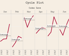
The utility of cycle plots in Tableau create time series analysis lies in their capacity to unearth trends that may be less discernible in other forms of time series visualizations. Such Tableau time series analysis is paramount in industries like business and economics, pinpointing seasonal fluctuations—like holiday sales surges or fiscal quarter dips—and in scientific fields, they can trace cyclical changes, exemplifying how certain months consistently outperform or underperform against an average.
15. Tableau Variance to Pane Average Chart
The image showcases a Tableau time series chart, specifically a variance to pane average bar chart, that delineates the percentage difference from a typical value over sequential periods, particularly for 2015, 2016, and 2017. The vertical axis details the percentage variance from an average, highlighted by the baseline ‘0%’ demarcation, while the horizontal axis chronicles the Tableau time series by year.
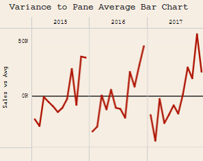
This type of visualization is instrumental in Tableau time series analysis for swiftly gauging how individual data points stack up against an average over temporal spans. It’s particularly potent in time series analysis in Tableau for spotlighting times with notable divergence from standard levels, possibly signaling outliers or emerging trends requiring closer scrutiny. In commercial contexts, such a Tableau creates a time series chart that can forewarn shifts in sales or other pivotal metrics compared to an average, informing tactical business choices. Similarly, in various operational spheres, it can be a critical tool for tracking consistency, ensuring quality controls, or maintaining any metric where equilibrium about an average is crucial.
16. Tableau Spark Area Chart
The image is a spark area chart, a variation of the sparkline chart designed to display trends over time for different categories—here, represented as regions: Central, East, South, and West. Each region’s data is shown as a filled area chart, allowing for the visualization of volume or magnitude and the trend over time.
Spark area charts are useful because they provide a quick visual summary of data and trends. This can be particularly helpful in comparing performance or changes across multiple categories. Unlike standard sparklines, the filled area of a spark area chart helps emphasize the relative weight of the data points, making it easier to assess volumes at a glance.
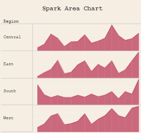
This compact visualization is ideal for dashboards where space is at a premium and emphasizes patterns rather than precise data points. It allows decision-makers to quickly scan for trends, such as seasonal variations or growth patterns, across different regions or categories without delving into the detailed numbers. This can be beneficial for identifying which areas are performing well or need attention, enabling rapid and informed decision-making.
17. Tableau Bump Chart
The chart depicted is a Tableau bump chart, a Tableau time series chart designed to track and visualize ranking changes over time within various categories. On the vertical axis, the rank is plotted—typically with top ranks at the summit and lower ranks descending—while the horizontal axis denotes time, presenting a time series in Tableau.
Employing a bump chart in a time series analysis, Tableau is a great way to underscore rank fluctuations and discern trends. Such a Tableau time series chart effectively illustrates the dynamics of how different items or groups shift in ranking relative to each other over a designated span. For instance, it’s adept at monitoring product sales performance ranks or the fluctuating popularity of items, especially where the rank of others precedes sheer numerical values.
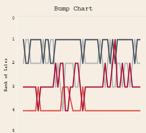
In the context of creating time series in Tableau, bump charts are invaluable for uncovering recurrent leaders, noting marked progressions or regressions, and capturing the essence of competitive or performance shifts over sequenced intervals. Their application is widespread in business intelligence for guiding tactical decisions, evaluating marketing strategies, and keeping tabs on performance metrics.
18. Enclosed Dot Chart
The image features an enclosed dot plot, which serves as an innovative Tableau time series chart, modifying the conventional dot plot by encircling the data points to highlight the range and spread within each listed category, like Art, Binders, and Chairs.
Aligned on the vertical axis are various product sub-categories. In contrast, the horizontal axis showcases a numerical range, possibly signifying sales data—a key element in creating a time series in Tableau. The scale stretches from 0K to 100K, providing scope for time series analysis in Tableau.
These enclosed dot plots are instrumental for pinpointing individual instances in a time series in Tableau and graphically conveying the data’s variance across each group. The breadth of the shapes encapsulating the dots offers immediate insight into the data’s volatility. For example, a broad enclosure in the Phones category on a Tableau time series chart indicates extensive variability instead of a narrower shape, which signifies consistency.
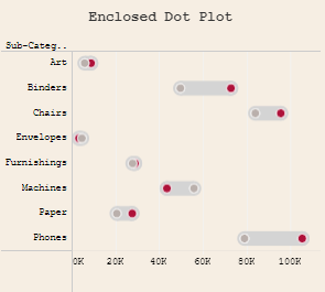
As a visual tool, its utility is pronounced in time series analysis in Tableau, facilitating comparisons between different distributions, pinpointing anomalies, assessing data clustering, and capturing the collective trend of each category. This format is supremely suited for distilling intricate data into an accessible format for business, academia, and beyond strategic decision-making.
19. Tableau Dot Plot
The image depicts a dot plot, a statistical chart that uses dots to represent data points along a number line. This dot plot shows different product categories, such as Accessories, Art, Chairs, and so on, on the vertical axis and a numerical scale on the horizontal axis, likely representing sales or units sold (0K to 25K).
Each category has a series of dots that likely correspond to individual data points, such as sales figures for specific items within the ‘Chairs’ category. Some categories have a cluster of dots around specific values, indicating a concentration of data points at that level.
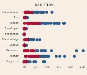
Dot plots help display the distribution and frequency of individual data points within a category, making it easy to see clusters, gaps, and outliers. They are perfect for comparing multiple distributions and identifying patterns or trends within categorical data. For example, in a sales context, a dot plot could quickly show which product categories have more items with high sales volumes, which have a wide range of sales volumes, and which are more uniform. This can help businesses identify strengths and weaknesses in their product lines and make informed decisions about inventory, marketing, and sales strategies.
20. Tableau Circle Timeline
The image depicts a Tableau time series chart, specifically a circle timeline chart, which is leveraged in time series analysis in Tableau to plot data points chronologically. It showcases various product categories like Art, Binders, Chairs, and others on the vertical axis, with the horizontal axis denoting the years from 2014 to 2018, facilitating a comprehensive Tableau time series analysis.
Within this Tableau, create a time series chart; each event or data instance is symbolized by circles along the timeline attributed to each product category. The dimensions of the circles could signify the intensity or relevance of the data points, be it sales volume or event frequency, which are crucial metrics in the Tableau time series.
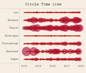
The importance of this visualization in time series analysis Tableau lies in its ability to grant immediate insight into temporal trends and patterns across several categories. This Tableau time series chart can uncover the event distribution, exhibit fluctuations in activity, and emphasize significant timeframes for each group. Such a chart is an invaluable asset for decision-makers for its ability to highlight strategy-informing patterns, evaluate initiative outcomes, and aid in the distribution of resources. It detects temporal trends and juxtaposes actions across diverse categories over identical timespans.
21. Tableau Barcode Chart
The image displays a barcode chart, a Tableau time series chart type that graphically represents the frequency of data points within varied categories on a Tableau create time series interface. Each vertical bar corresponds to a data point within product categories, such as Accessories, Bookcases, and Chairs, mapped on the vertical axis. The horizontal axis serves as a scale for Sales, marking the sales volume or revenue, ranging from 0K to 25K, which is integral to time series analysis in Tableau.
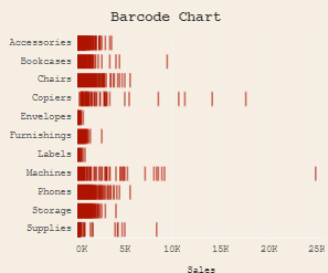
Barcode charts are particularly effective in Tableau time series analysis, laying out the data concentration and dispersion across categories. The pattern of bars enables a swift assessment of which categories experience a higher incidence of sales, which is vital for the time series analysis Tableau. This visualization is adept at revealing patterns, highlighting clusters of sales figures, or detecting outliers indicative of atypical high or low sales volumes.
In the domain of time series in Tableau, this chart serves as an exploratory tool for swiftly discerning trends, variations, and the aggregate density of data points, facilitating informed and swift decision-making processes. It aids businesses in identifying areas warranting additional exploration or intervention, including supply chain management or precision marketing strategies.
Tableau Time Series: Conclusion
In conclusion, the 21 Tableau time series charts showcased are essential for analysts, data scientists, and business strategists dedicated to extracting meaningful insights from time-based data. These Tableau time series charts excel in transforming complex datasets into clear, intuitive visuals, highlighting Tableau’s robust capabilities in visual analytics. They facilitate the tracking of trends through time series analysis in Tableau and the storytelling of data’s underlying patterns. The versatility ranges from the meticulous detail of a line graph to the broad overview provided by a circle timeline chart, all within the Tableau time series chart suite. Such tools in Tableau create time series visualizations that bolster confidence in data-driven decision-making. Tableau’s adaptability in crafting, tailoring, and exploring deep time series analysis Tableau solidifies its status as a vital instrument amidst the dynamic realm of data visualization.