A well-designed social media analytics dashboard brings those moving parts into a single, reliable source of truth. By unifying reach, engagement, efficiency, and revenue metrics, it turns raw platform data into practical answers: what’s performing, why it’s working, and where to double down. Filters for platform and post type, period toggles, and mini trend charts make it easy to compare the last few months without exporting a single CSV. Side-by-side KPIs such as Impressions, Reach, Engagements, CTR, CPC, and Revenue reveal whether audience growth is translating into cost-effective outcomes. For managers, analysts, and leadership alike, the dashboard shortens the distance between insight and action—supporting smarter pacing, creative iteration, and budget allocation. In short, a social media analytics dashboard is the operating panel for modern, measurement-driven marketing.
Table of Contents
#1 Social Media Analytics Dashboard Example – Social Marketing Tracker
This is a social media analytics dashboard for Paid Social that consolidates advertising performance across Facebook, Twitter/X, LinkedIn, and Instagram. At the top, executive KPI tiles report total Spend, Impressions, and Likes for the latest quarter, each with small trend sparklines and period-over-period deltas. A global quarter filter lets users switch time frames.
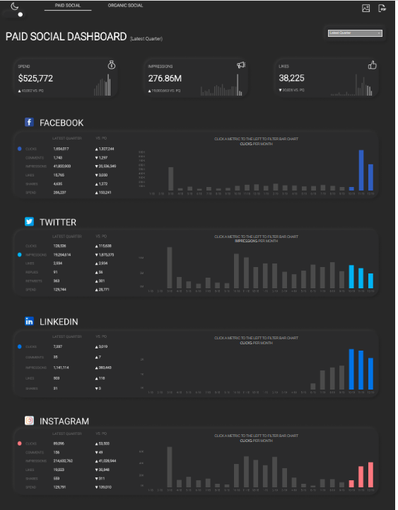
Each network has its own panel showing headline metrics (Clicks, Conversions, Impressions/Reach, Engagements, Likes, Spend) with “Latest Quarter,” “Vs. Q0,” and YoY comparisons. To the right, the dashboard utilises clean bar charts to visualise time trends—e.g., clicks per quarter and impressions per month—highlighting the most recent periods in accent colours for quick pattern detection. The design uses a dark theme, compact tables, and contextual tooltips/captions such as “click a metric to filter the bar chart,” implying interactive cross-filtering.
This social media analytics dashboard would be valuable for performance marketers and paid social specialists who manage budgets and pacing, marketing managers tracking campaign effectiveness, and CMOs or growth leaders needing a cross-channel snapshot. Analysts can use it to spot spikes or underperformance by platform and period, while finance or procurement teams can compare spend vs. outcomes before reallocating budgets. Product and content teams may also reference engagement and click trends to plan creative, landing pages, and posting cadences aligned with what’s working on each network.
#2 Social Media Analytics Dashboard Example – Social Media Dashboard
This Twitter social media analytics dashboard tracks channel performance over a selected month within the June–October 2020 window. KPI tiles at the top summarise core outcomes—Impressions, Engagements, Hashtag Clicks, Likes, Replies, and Retweets—each paired with a small trend sparkline and a percentage change indicator for quick directional context.
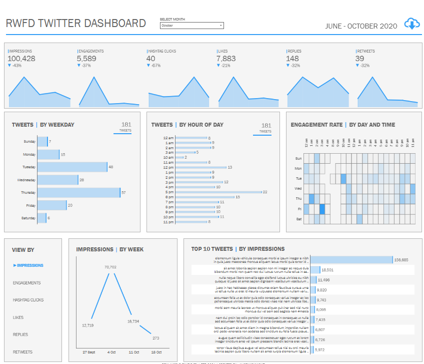
The middle section breaks the activity down by time. “Tweets by Weekday” uses horizontal bar charts to reveal which days the account is most active. “Tweets by Hour of Day” presents another horizontal bar chart to highlight posting cadence across the 24-hour cycle. An “Engagement Rate by Day and Time” heatmap identifies the precise windows when audiences interact most, enabling the rapid identification of high-impact publishing slots.
The lower section supports deeper analysis. A single-metric selector (left) switches the focus of charts. “Impressions by Week” shows a simple line chart to spot spikes and dips across recent weeks. “Top 10 Tweets by Impressions” ranks posts with horizontal bars, surfacing standout content and the scale of its reach.
This dashboard is useful for social media managers and paid/organic specialists optimizing posting schedules and creative, marketing managers monitoring campaign effectiveness, content teams planning editorial calendars, and analysts preparing channel performance reports. Executives get a concise snapshot of Twitter traction and can quickly see whether engagements align with campaign goals and budget expectations.
#3 Social Media Analytics Dashboard Example – Social Media Performance Dashboard
This Twitter/X social media analytics dashboard provides a month-level and YTD view of channel performance with a focus on link posts. KPI tiles across the top summarise core outcomes—Impressions, Likes, Retweets, and Comments—each with compact area-sparkline trends, a comparison to the previous month (PM), and percentage deltas for rapid context. Toggle buttons let users switch between Current Month and Current YTD to understand short-term momentum versus longer-term baselines.
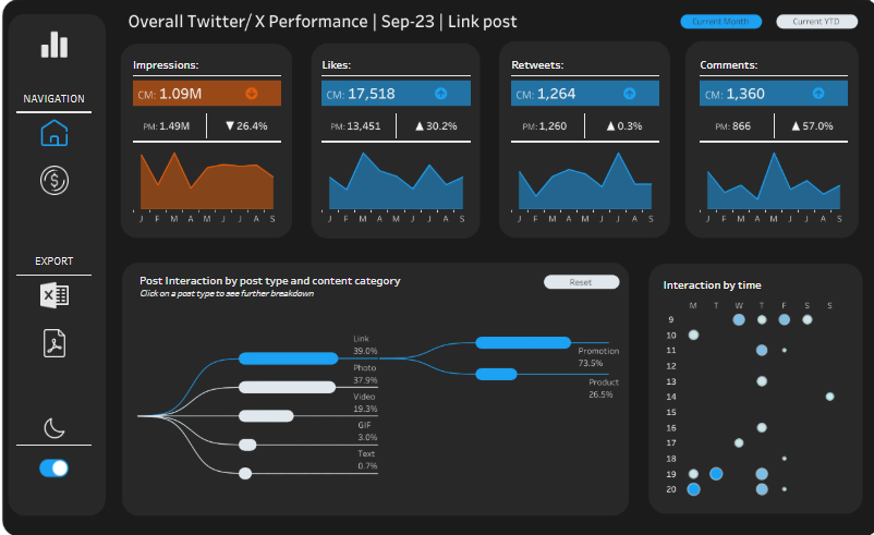
Below, a flow diagram (Sankey) visualises Post Interaction by post type and content category, showing how engagement distributes across formats such as Link, Photo, Video, GIF, and Quote, then splits into Promotion versus Product content. This makes it easy to spot which creative types and categories drive the largest share of interactions. On the right, an Interaction by time bubble matrix maps engagement by hour of day and weekday; larger circles indicate heavier interaction, guiding optimal publishing windows.
This dashboard is useful to social media managers optimising posting cadence and creative mix, growth and performance marketers allocating budget between promotional and product content, community managers monitoring conversation health, content strategists planning editorial calendars, and marketing leaders who need an at-a-glance read on whether current activity is trending up or down relative to plan.
#4 Social Media Analytics Dashboard Example – Social Media Engagement And Reach
This social media analytics dashboard unifies engagement and reach across Facebook, Instagram, LinkedIn, and Twitter to show what’s working by channel, time, and post. The header table summarizes core metrics—Posts, Impressions, Likes, Comments, Shares, Clicks, and Max Followers—so teams can benchmark platforms at a glance and view a grand total. A date slider frames the analysis period.
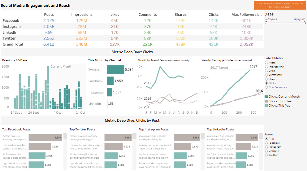
The “Metric Deep Dive: Clicks” section (switchable to other metrics) combines several visuals: a 30-day column chart to spot recent spikes; horizontal bar charts showing “This Month by Channel” for quick mix comparison; a monthly time-series line chart to track trend vs. seasonality; and a cumulative pacing line that compares the current year to the prior year and a yearly target. At the bottom, leaderboard panels display “Top Posts” for each network with horizontal bars, letting users identify high-performing creatives and headlines instantly. Filters on the right allow metric selection and source toggling for focused analysis.
Who finds it useful: social media managers optimising cadence and content; campaign and growth marketers allocating spend by channel; content strategists planning editorial calendars; analytics teams reporting performance vs. target; and marketing leaders or CMOs who need a concise, cross-channel snapshot to inform budget shifts and quarterly goals.
#5 Social Media Analytics Dashboard Example – Social Media Dashboard
This social media analytics dashboard summarizes Twitter engagement for August 2020 using a clean grid of KPI tiles. Each tile focuses on one interaction type—Likes, Replies, Detail Expands, Retweets, URL Clicks, Hashtag Clicks, Media Views, and Profile Clicks—so teams can scan volume, spot movement versus the previous month (PM), and view a compact sparkline showing recent trend across June to October. Percentage deltas beneath each metric quickly signal acceleration or slowdowns without leaving the overview.
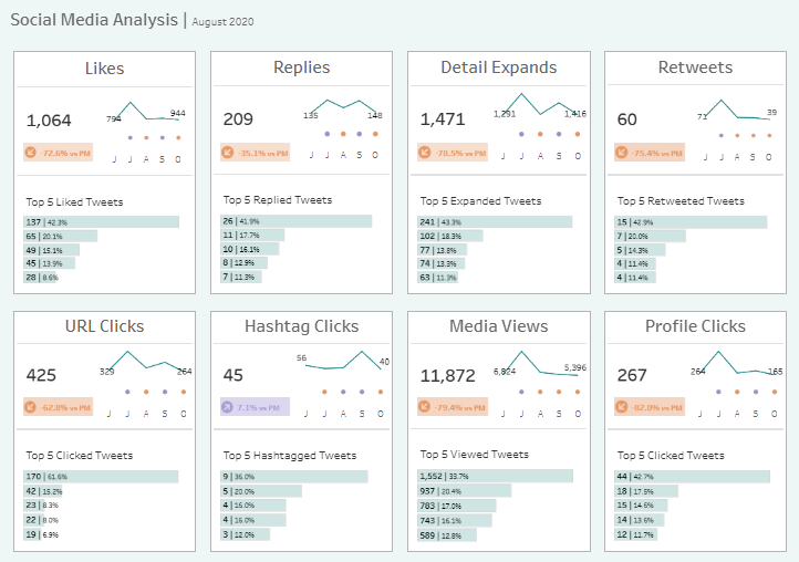
Beneath the headline number and sparkline, every tile lists a “Top 5” leaderboard with horizontal bars. These ranked snippets surface the posts contributing the largest share of each outcome: most-liked, most-replied, most-expanded, most-retweeted, most-clicked URLs, top hashtag performers, most-viewed media, and most-clicked profiles. The small-multiples layout makes it easy to compare patterns across metrics—e.g., whether posts that attract likes also drive URL clicks or media views—and encourages rapid root-cause investigation.
Who benefits: social media managers and community teams monitoring engagement health; content strategists identifying formats, topics, and hashtags that resonate; campaign and growth marketers evaluating the effectiveness of promotional tweets versus organic conversation; and marketing leaders seeking a concise month-end snapshot to inform editorial planning, paid amplification, and budget allocation. The combination of KPIs, micro-trends, and post leaderboards provides a fast, actionable view of what worked and where attention should shift next month.
#6 Social Media Analytics Dashboard Example – Social Media Monthly Report
This social media analytics dashboard presents a month-by-month Twitter/X performance report (here: July 2020) designed for quick scanning and deeper exploration. KPI tiles along the top summarise Tweets Posted, Average Engagement Rate, Total Impressions, and Total Engagements, each with compact mini-bar trend indicators and month-over-month deltas for context. A “Top Tweets” table ranks posts by Impressions, Likes, Retweets, and Engagement Rate, helping teams identify the creative and timing that drove outsized results.
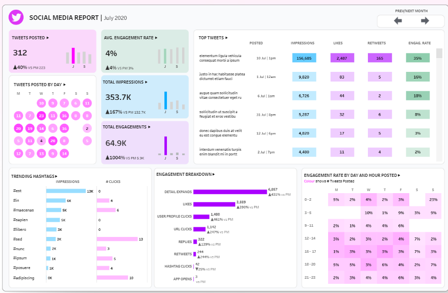
Timing patterns are surfaced with two visuals: a bubble calendar showing Tweets posted by day of month, and a day-by-hour heatmap that maps Engagement Rate across the week to pinpoint high-yield posting windows. Content signals come through the Trending Hashtags bar charts (Impressions and Clicks) and an Engagement Breakdown with horizontal bars for Detail Expands, Likes, Profile Clicks, URL Clicks, Replies, Retweets, Hashtag Clicks, and App Opens. Prev/Next controls enable fast period navigation to compare momentum.
Who finds it useful: social media managers optimising cadence and content mix; content strategists selecting topics and hashtags; community managers monitoring interaction quality; growth and performance marketers aligning paid boosts with organic winners; analysts preparing month-end reports; and marketing leaders who need a concise snapshot of channel health, what resonated, and where to allocate effort and budget next month.
#7 Social Media Analytics Dashboard Example – Social Media KPIs
This social media analytics dashboard gives a compact, at-a-glance view of video channel health using a grid of KPI tiles with sparklines and month-over-month deltas. It tracks the full funnel from reach to monetization: Total Watch Time, Average Watch Time (seconds), Total Video Views, Total Unique Views, Average Views per Viewer, Impressions CTR, Audience Retention, and Engagement. Creator growth and revenue are covered through Subscribers Gained, Subscribers Lost, Estimated Revenue, and Monetised Playbacks.
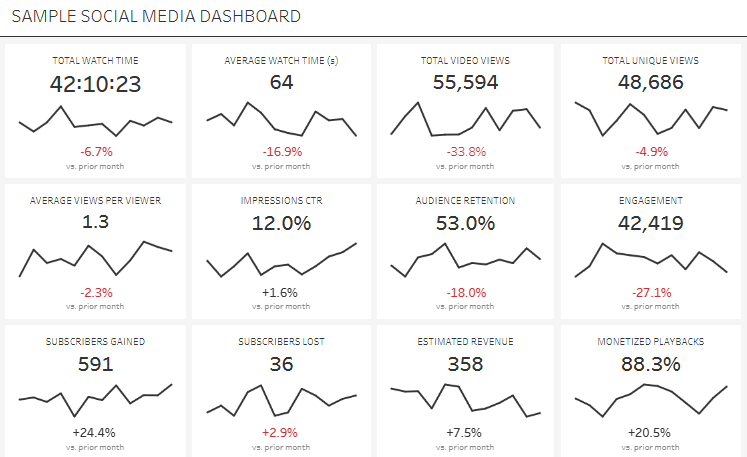
Each metric tile combines a headline value with a minimalist line sparkline to show recent trajectory, plus a color-coded variance vs. the prior month to reveal acceleration or decline without drilling down. The small-multiples layout lets viewers compare patterns side by side—for example, whether lower Average Watch Time coincides with drops in Audience Retention, Engagement, and Revenue, or whether rising CTR is translating into more Views and Watch Time.
This dashboard is useful for social media managers and channel owners who need to monitor performance daily, content strategists optimizing topics, hooks, and video length, growth marketers aligning promotion with content that sustains retention, and executives who want a clear pulse on revenue drivers. Analysts can use the tiles to flag anomalies, prioritise experiments (thumbnails, intros, cadence), and quantify how improvements in retention or CTR cascade into watch time and monetized playbacks.
#8 Social Media Analytics Dashboard Example – Social Media Marketing Dashboard
This social media analytics dashboard summarizes key marketing metrics for a selected platform and post type, with quick filters at the top and a left navigation for Dashboard, Key Metrics, Deep Dive, and Download. Six KPI tiles track Impressions, Reach, Engagements, Total Revenue, CPC, and CTR. Each tile shows the current value, a comparison to the previous three months, and a colored percentage delta to indicate gains or declines, making trend shifts immediately visible.
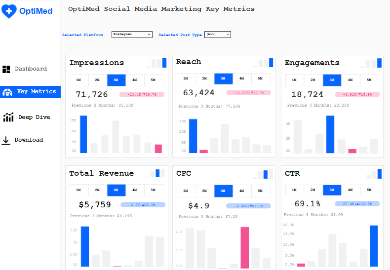
Across every KPI, small in-tile column charts illustrate recent performance, while one-click timeframe toggles (1M, 2M, 3M, 4M, 5M) switch the window for fast period analysis. Revenue and efficiency metrics sit beside volume and engagement, allowing viewers to judge whether increased activity is translating into cost-effective outcomes. The consistent layout and typography make it easy to scan from top left to bottom right, spotting outliers (e.g., a rising CTR alongside a worsening CPC) and prioritising corrective actions.
Who would use it: social media managers optimising cadence and creative; performance marketers monitoring cost and conversion proxies; channel owners accountable for platform growth; analysts preparing monthly reports; and marketing leaders who need a concise readout to guide budget allocation, platform prioritisation, and campaign pacing. The blend of directional deltas, mini trend charts, and timeframe toggles supports rapid, data-driven decisions.
Dashboards only create value when they drive decisions. Establish a weekly ritual: review headline KPIs, scan the 1–5 month trend bars for momentum shifts, and flag platforms or post types that diverge from targets. If CTR rises while CPC worsens, test audience and placement changes; if Reach grows without Engagements, adjust creative hooks or calls-to-action. Pair the dashboard with clear benchmarks, annotation of major campaigns, and a lightweight experimentation log so wins are repeatable. Revisit definitions (e.g., what counts as an engagement) quarterly to keep metrics consistent across teams. Finally, evolve the social media analytics dashboard as strategy matures—add cohort views for new vs. returning audiences, tie revenue to specific campaigns, and surface alerts for statistically significant changes. When everyone—from creators to the CMO—looks at the same metrics, conversations get faster, experiments get bolder, and marketing spend works harder.