
A travel dashboard is a powerful tool that transforms complex travel data into visually engaging and easily digestible insights. Whether you’re tracking passport strength, documenting personal adventures, analysing air traffic patterns, or understanding tourism’s impact on global economies, a well-designed travel dashboard can tell a compelling story at a glance. With a blend of maps, charts, and interactive elements, each travel dashboard caters to a wide range of users, from travel enthusiasts and bloggers to policymakers and business leaders. In this blog, we’ll explore five unique examples of travel dashboards, each offering a different perspective on how data can enhance our travel experience and understanding. From visualising visa-free destinations to showcasing personal journey maps, these examples demonstrate the versatility and creativity possible when design and data come together. Whether you’re seeking inspiration for your own project or love exploring data-driven stories, each travel dashboard featured here is sure to impress and inform.
Table of Contents
#1 Travel Dashboard – The World’s Dependency on the Travel Industry
This travel dashboard illustrates how reliant individual economies are on travel and tourism, condensing a global data set from the WTTC into a single, easily scannable view. A large title and brief narrative provide context, explaining that the figures measure the share of each nation’s GDP generated directly by tourism-related industries—hotels, airlines, transportation services, and tourist activities.
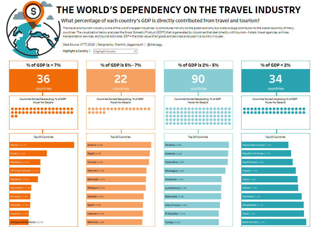
The body is divided into four vertical panels that segment countries by contribution brackets: “> 7 %,” “5 – 7 %,” “2 – 5 %,” and “< 2 %.” At the top of every panel, a numeric KPI tile, coloured in a distinct orange-to-teal palette, shows how many countries fall into that range. Beneath each tile is a dot plot strip chart: every circle represents one country, sorted horizontally by percentage in either a descending or ascending order, so viewers can immediately spot outliers. The bottom section of each panel uses a horizontal bar chart to list the ten most tourism-dependent economies within the bracket, pairing country names with exact percentages for quick comparison.
Travel ministries, destination marketing organisations, airlines, hotel chains, development banks and economic researchers could all leverage this travel dashboard. It helps them benchmark vulnerability to tourism shocks, identify emerging markets, prioritise investment, and craft policy for diversification or targeted promotion.
#2 Travel Dashboard – COVID impact on Travel – Passenger Year over Year growth
This travel dashboard visualises the year-over-year evolution of air passenger traffic on flights connected to Europe, spotlighting the massive disruption caused by COVID-19. Across the top, the travel dashboard’s panoramic column chart displays monthly growth from 2006 to 2020. Positive bars are tinted blue, pink, or orange, while negative bars are purple or crimson. Inline callouts highlight milestones—the 2007 boom, the 2008 financial crisis, the 2010 Eyjafjallajökull eruption, and April 2020’s 99-per-cent collapse—while a subtle reference line grounds the zero baseline. Users can click any bar to refresh the maps below, linking temporal data with spatial context.
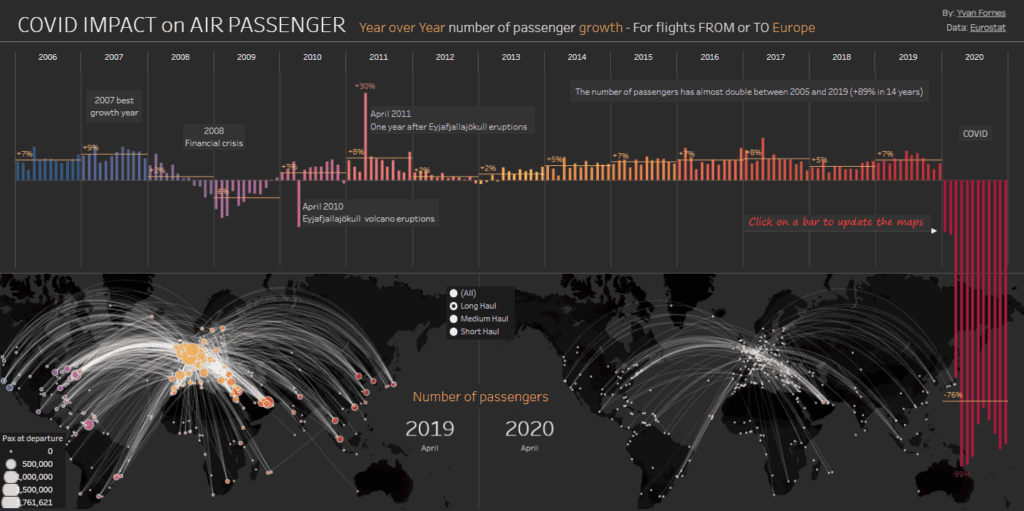
The lower section presents twin proportional-symbol flow maps. Great-circle arcs sketch routes radiating from European hubs, and airports are rendered as graduated circles whose diameters encode outbound passenger volume. The left map represents April 2019; the right depicts April 2020, revealing a dramatic thinning of connections. A legend and radio button selector let viewers isolate long-, medium-, or short-haul networks for sharper analysis. Airlines, airport route development teams, tourism boards, aircraft lessors, investment analysts, and public health planners can mine this travel dashboard for actionable insights. It exposes network resilience, pinpoints the markets hardest hit, and quantifies demand shock—critical intelligence for scheduling, capacity planning, aid allocation, scenario modelling, and strategic recovery planning, as well as policy risk assessment.
#3 Travel Dashboard – The Travel Bug In Me
This travel dashboard tells a personal visual story of leisure trips taken over the past 20 years, blending narrative text with engaging data displays. At the centre, a world map shows travel routes originating from Cleveland, Ohio, and Ireland, highlighting key destinations like Costa Rica, Morocco, Greece, Thailand, and Australia. Each location is annotated with short, personal notes about the trip experience, adding a storytelling layer to the data.
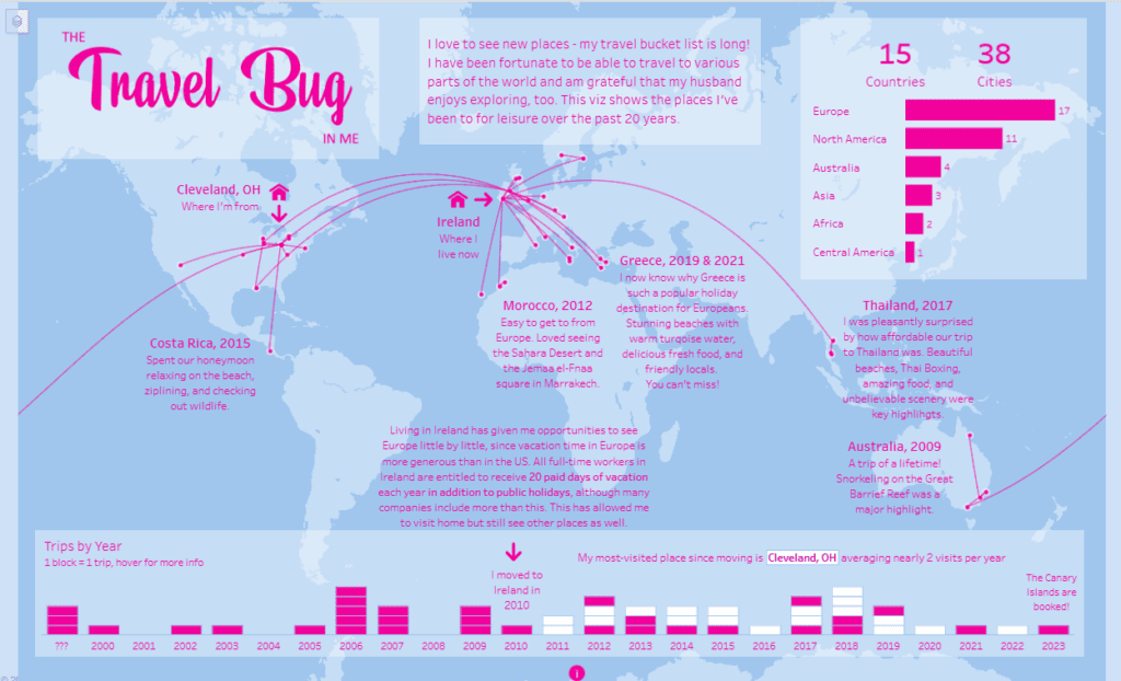
The travel dashboard uses a combination of flow lines to indicate travel paths and proportional dots to mark visited cities. On the right, a horizontal bar chart breaks down the number of cities visited by continent, giving quick insights into travel distribution. At the bottom, a trips-by-year timeline is presented with block-style bars, where each block represents a single trip, allowing viewers to see the frequency and timing of travels year by year.
This travel dashboard would be helpful for travel bloggers, personal historians, or anyone wanting to document their journeys visually. It could also inspire those working in tourism marketing or data storytelling, showcasing how personal experiences can be brought to life through design. The clean, colourful layout makes it approachable for a broad audience, combining personal narrative with structured visual elements.
#4 Travel Dashboard – Passport Privilege
This travel dashboard visualises global passport strength by showing how many countries citizens can enter without a visa in 2023. Based on the Henley Passport Index and International Air Transport Association (IATA) data, the travel dashboard uses a tile map to display each country as a hexagonal or circular tile, colored by the number of visa-free destinations they can access. Darker colours represent stronger passports, while lighter shades indicate fewer travel privileges.
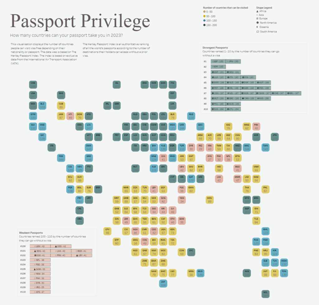
To the right, a bar chart ranks the top 10 strongest passports, highlighting the countries whose citizens enjoy the most incredible freedom of movement. A separate table lists the weakest passports, identifying those with the fewest visa-free travel options. Both visuals make it easy to compare passport strength across regions and spot global patterns of travel inequality.
This travel dashboard would be helpful for immigration consultants, travel agencies, policymakers, global mobility specialists, and frequent international travellers. It provides quick and precise insights into how nationality affects travel opportunities and can help advise clients, plan trips, or even consider dual citizenship or residency options. The compact, visually rich design allows for immediate understanding of a complex, globally relevant topic.
#5 Travel Dashboard – Countries Passport Index
This travel dashboard provides a visual analysis of a country’s passport strength based on the number of visa-free destinations available to its citizens. The primary visualisation on the travel dashboard is a colourful bubble scatter plot where each circle represents a country, plotted by the number of visa-free destinations along the x-axis. The size of each bubble corresponds to the country’s population, while colour coding distinguishes continents, creating an easy way to compare regions globally.
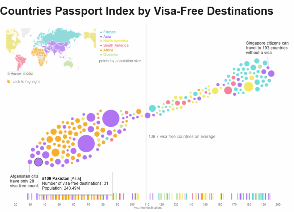
Highlights on the travel dashboard, such as Singapore’s access to 193 visa-free destinations and Afghanistan’s limited access to 28, emphasise the vast disparities between countries. A secondary layer of colored tick marks along the x-axis provides additional reference for visa-free access distribution across the world. A mini world map, coloured by continent, is included for geographic context, and users can interact with the chart by clicking to highlight specific countries.
This travel dashboard would be especially valuable for immigration consultants, frequent travellers, policymakers, and global mobility advisors. It offers a quick, visually engaging overview of travel freedoms tied to nationality, helping users understand travel privileges, identify passport weaknesses, and advise on citizenship or visa strategies. Its clean layout and interactive features make complex global data both accessible and insightful.
A travel dashboard has the remarkable ability to simplify vast amounts of information and present it in a way that is both beautiful and informative. The five examples highlighted in this blog showcase just how diverse and impactful a travel dashboard can be, from personal travel logs and air passenger analyses to global passport rankings and tourism dependency maps. Each travel dashboard offers a unique lens through which we can view the world, making data more accessible and travel experiences more meaningful. For designers, analysts, marketers, and travel enthusiasts alike, these dashboards offer inspiration on how to creatively share stories, uncover patterns, and make informed decisions using data. As global travel continues to evolve, the importance of clear, interactive, and visually stunning travel dashboard designs will only grow. Whether used for personal reflection or strategic planning, a great travel dashboard not only informs but also sparks curiosity and a deeper appreciation for the journey itself.


