
From analysing sales figures and streaming metrics to tracking award nominations and musical compositions, a music dashboard provides valuable visual representations that help industry professionals, music enthusiasts, and content creators interpret extensive datasets. In this blog post, we showcase 8 exceptional music dashboards that illustrate how data visualisation can uncover fascinating insights about music history, genre evolution, artist impact, and audience preferences, all while delivering visually captivating storytelling.
Table of Contents
#1 Music Dashboard Example – U.S. Recorded Music Revenues by Format
The U.S. Recorded Music Revenues by Format Dashboard offers a comprehensive visual analysis of music industry revenues across multiple formats from 1973 to 2024. This music dashboard uses a stacked bar chart to illustrate the revenue distribution of formats such as LP/EP, Vinyl Singles, CDS, Cassettes, and digital formats like streaming and downloads. Each format is depicted in distinct colours, allowing users to spot trends and revenue composition shifts over time easily.

Interactive features in the music dashboard include drop-down filters for specific formats, a date range slider, and options to view revenue in nominal terms or adjusted for inflation. These controls enable users to gain granular insights into how each format has performed, emphasising the rise of digital streaming and the decline of physical formats like CDS and cassettes.
This music dashboard is valuable for music industry analysts, record label executives, and digital streaming service managers looking to understand revenue patterns, identify emerging formats, and refine market strategies. It also serves as a resource for academic researchers analysing the economic impact of technological shifts within the music industry.
#2 Music Dashboard Example – 50 Great JAZZ Trumpeters

The 50 Best Jazz Trumpeters of All Time Music Dashboard presents a visually compelling analysis of prominent trumpeters, charting their lifespans and active eras throughout jazz history. This music dashboard utilises a timeline chart, plotting each musician’s birth year, death year (if applicable), and career peak. Each line represents a trumpeter, with intersecting points marking key periods in jazz evolution, such as Swing, Bop, Hard Bop, Free Jazz, and Fusion Jazz & Rock.
The dark background and minimalist design emphasise the chronological flow, allowing users to trace how each artist’s career overlaps with various jazz movements. Notable musicians like Louis Armstrong, Miles Davis, and Dizzy Gillespie are positioned within their respective jazz eras, illustrating how each contributed to the genre’s evolution.
This music dashboard is handy for music historians, jazz enthusiasts, and educators who want to understand the interconnectedness of influential jazz trumpeters and the genre’s historical development. It also serves as a compelling storytelling tool for music bloggers and content creators aiming to highlight the legacies of these jazz icons in a visually engaging manner.
#3 Music Dashboard Example – United by Music or Divided by Politics
The Eurovision Song Contest 2024 Music Dashboard comprehensively compares public and jury votes across participating countries, effectively highlighting discrepancies and alignments in voting patterns. This music dashboard utilises a bar chart layout, organising data into three primary columns: Public Votes, Jury Votes, and Jury vs. Public Difference. Each country is represented by a row with colored bars indicating vote counts, making it easy to identify significant gaps between public and jury preferences.

The contrasting colours in the music dashboard emphasise the differences between public and jury voting outcomes, exposing potential political or regional biases in the scoring process. Users can click on any country to access detailed vote breakdowns, adding depth to the analytical insights provided.
This music dashboard is particularly valuable for Eurovision enthusiasts, analysts, and media outlets interested in exploring voting dynamics and their effects on contest results. It also serves as a compelling visual storytelling tool for content creators and political analysts examining how public and jury opinions differ, potentially sparking discussions about fairness and transparency in major music competitions.
#4 Music Dashboard Example – Hans Zimmer’s Music
The Hans Zimmer Music Dashboard provides a visually engaging overview of the prolific composer’s work, showcasing the number of songs released across five-year intervals from 1985 to 2019. This music dashboard utilises a dot matrix chart, where each dot represents a song, and the density of dots illustrates the volume of Zimmer’s work in each period. The left section of the dashboard forms a portrait of Zimmer composed entirely of these song dots, each clickable to play the corresponding track on Spotify.

The right section organises Zimmer’s discography chronologically, allowing users to observe patterns in his output over time. Users can filter by album and award categories, gaining deeper insights into how Zimmer’s work has evolved across different cinematic eras. The colour intensity of each dot indicates the length of the song, offering another layer of analysis regarding the duration of his compositions.
This music dashboard is particularly valuable for film score enthusiasts, music analysts, and Zimmer fans who want to explore his extensive catalogue interactively. It also serves as a compelling visual tool for content creators and educators seeking to highlight the composer’s impact on film music across multiple decades.
#5 Music Dashboard Example – Beautiful Music
The Symphony No. 40 in G Minor Music Dashboard visualises the composition of Mozart’s iconic symphony, focusing on the first movement, “Molto Allegro.” This music dashboard employs a radial scatter plot, where each colored dot represents a musical note played by a specific instrument, such as flute, oboe, clarinet, bassoon, horn, violin, viola, cello, and double bass. The circular arrangement mimics the flow of the music, creating a dynamic and visually striking representation of the symphony’s structure.

Each instrument is assigned a distinct colour, allowing users to track specific musical lines and observe how different sections contribute to the overall composition. The dots, which indicate note duration and intensity at varying sizes and densities, effectively convey the musical complexity and rhythmic patterns.
This dashboard is particularly valuable for music students, composers, and classical music enthusiasts who want to understand Mozart’s composition techniques better. It also serves as an engaging educational tool for those exploring orchestration, as the visualisation highlights how different instrument groups interact throughout the movement. Additionally, the dashboard provides an interactive element, enabling users to isolate individual instruments and focus on their specific contributions to the symphony.
#6 Music Dashboard Example – Music Sales in US
The 40 Years of US Music Sales Music Dashboard comprehensively analyses music sales across various formats from 1973 to 2019. This music dashboard utilises a streamgraph, where each segment represents a specific music format, such as 8-Track, Vinyl, Cassette, CD/DVD, Downloads, and Streaming. The layered structure visually depicts the rise and decline of formats, highlighting how digital formats eventually dominated physical media over the decades.

Users can toggle between metrics like units, revenue, and adjusted revenue to extract targeted insights into sales trends. The music dashboard also allows sorting by value or chronology, enabling flexible data exploration. The distinct colour-coded segments effectively differentiate between formats, while the flowing design emphasises the shifting dynamics of music consumption.
This music dashboard is handy for industry analysts, record label executives, and digital streaming platforms aiming to understand long-term market trends. It also functions as an educational tool for students studying music business and marketing, illustrating how technological advancements and consumer preferences have reshaped the music industry. Additionally, content creators and data visualisation enthusiasts can leverage this music dashboard as a compelling example of effectively presenting complex data in a visually impactful format.
#7 Music Dashboard Example – Alt-Nation (Spotify Playlist)
The ALT-NATION Music Dashboard presents a curated Spotify playlist of alternative tracks, visually organised using radar charts that display various audio features for each track. This music dashboard includes 513 tracks, 176 artists, and 262 albums, allowing users to explore songs based on specific audio characteristics such as danceability, energy, valence, speechiness, acousticness, and liveness.

Each track in the music dashboard is represented by a radar chart, with each axis corresponding to a specific audio feature. The shape of the radar chart provides a quick visual representation of a song’s unique audio profile, enabling users to compare multiple tracks at a glance. The music dashboard also includes a customizable input area where users can adjust sliders to emphasise particular features, and the system will highlight tracks that align with those preferences.
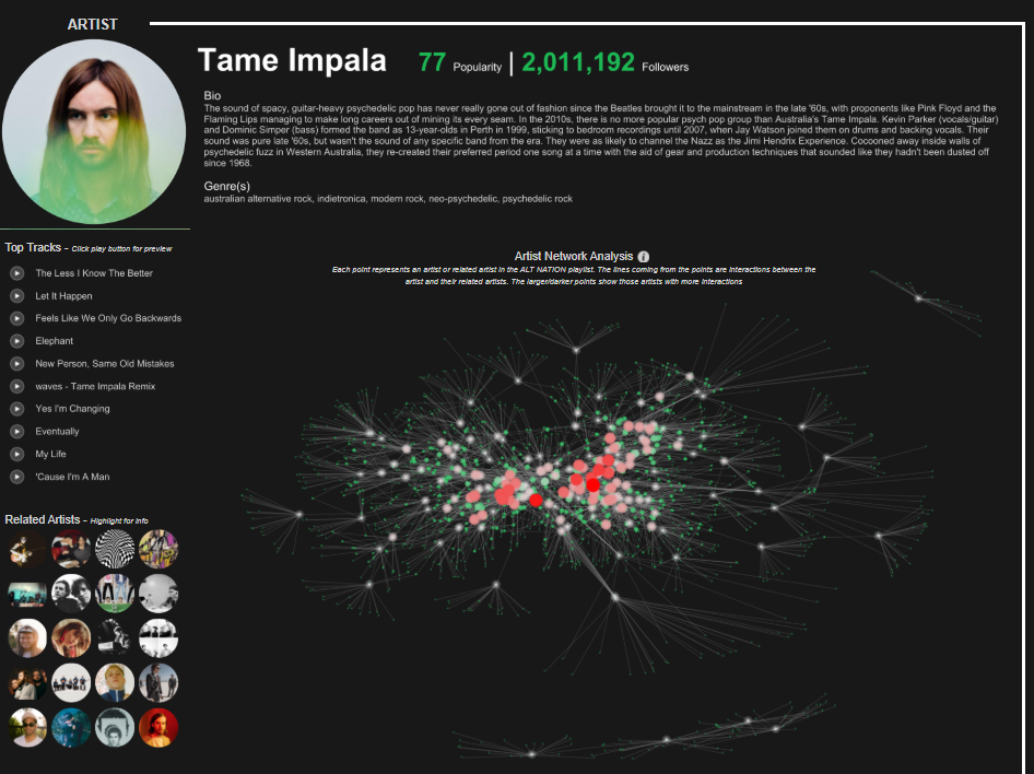
This music dashboard is particularly valuable for music enthusiasts, playlist curators, and analysts seeking to explore and organise songs based on specific sound attributes. It also serves as a useful tool for discovering new music that matches particular mood or genre criteria. It is an engaging resource for content creators aiming to craft tailored playlists or music recommendations using data-driven insights.
#8 Music Dashboard Example – GRAMMY AWARDS
The Grammy Awards Best Alternative Music Album Music Dashboard visualises Grammy nominations and wins for the Best Alternative Music Album category from 1991 to 2022. This music dashboard employs a circular node chart with a concentric circle pattern representing each artist. The size of the circles indicates the number of nominations, while the inner rings highlight Grammy wins. The more prominent and layered the circle, the more nominations and wins an artist has accumulated in this category.

Artists such as Beck, Radiohead, and Björk display larger, more intricate circle patterns, reflecting their multiple nominations and wins over the years. Each circle is color-coded to differentiate between wins (highlighted in gold) and nominations (outlined in blue), making it easy to identify which artists have consistently dominated the Best Alternative Music Album category.
This music dashboard is handy for music historians, Grammy analysts, and fans interested in exploring the evolution of alternative music recognition at the Grammy Awards. It also serves as an informative visual resource for content creators, allowing them to quickly identify trends, standout artists, and notable Grammy winners in the alternative genre. The structured layout provides a visually engaging way to track the impact and influence of key artists in alternative music over three decades.
The 8 examples highlighted in this post showcase the versatility of music dashboards, from tracking album sales and streaming trends to visualising award nominations and analysing song structures. Whether you’re a data analyst, music marketer, or simply a fan of compelling visualisations, these dashboards offer a unique way to explore the intersection of music and data. By leveraging effective data visualisation techniques, these dashboards transform raw data into engaging narratives that resonate with diverse audiences.


