
Week 2 of How to Learn Tableau: Exploring & Analysing Data Like a Pro
Learn Tableau in 4 weeks! This four-week study plan is designed for a complete beginner to prepare for the Tableau Desktop Specialist certification exam.
It covers all exam domains:
- Connecting to & Preparing Data
- Exploring & Analyzing Data
- Sharing Insights
- Understanding Tableau Concepts
As outlined in the official exam guide. The schedule assumes ~20 hours per week (~3 hours per day) and incorporates a mix of official Tableau resources, reputable third-party tutorials, hands-on practice, and mock exams.
Each week has specific goals and daily tasks to build your skills progressively.
By following this plan, you’ll gain foundational Tableau knowledge and confidence to ace the exam. (Note: The exam is 40 scored questions in 60 minutes (plus 5 unscored questions) with a 48% passing score, but aim higher for a comfortable pass!)
Week 2 of How to Learn Tableau: Exploring & Analysing Data Like a Pro
Table of Contents
Learn Tableau – Week 1: Tableau Fundamentals – Connecting & Preparing Data (Domain 1, Intro to Domain 4)
Focus: Setting up your Tableau environment, learning the interface, and mastering data connections and preparation.
You will also grasp fundamental Tableau concepts (like dimensions vs. measures) that are crucial for understanding how Tableau works.
Day 1: Setup and Tableau Orientation
Goal: Get Tableau running and explore the UI
Install Tableau
Download and install Tableau Public (free) or start a 14-day Tableau Desktop trial, (If you’re a student, claim a free one-year Tableau Desktop license with your school email.
Familiarize with the Interface
Launch Tableau and spend time exploring the workspace – the Data pane, shelves (Rows, Columns), Marks card, and Show Me panel. Watch Tableau’s official “Getting Started” free training video or a beginner-friendly YouTube tutorial for an overview of how to connect data and create a simple chart.

A. Workbook name – A workbook comprises multiple sheets, and each sheet can be a worksheet, dashboard, or story. (See Workbooks and Sheets for details.)
B. Cards and shelves – Drag fields onto cards or shelves in the workspace to populate your view with data.
C. Toolbar – Access commands, as well as analysis and navigation tools, from the toolbar.
D. View – The canvas where you build a visualization (or “viz”).
E. Start-page icon – Click this icon to return to the Start page and connect to data. (See Start Page for details.)
F. Side Bar – In a worksheet, the side bar houses the Data pane and the Analytics pane.
G. Data Source tab – Click this tab to open the Data Source page and examine your data. (See Data Source Page for details.)
H. Status bar – Shows information about the current view.
I. Sheet tabs – Each tab represents a sheet in your workbook—whether a worksheet, dashboard, or story. (See Workbooks and Sheets for details.)
Connect to Sample Data
To learn Tableau, use Tableau’s Sample Superstore dataset (available in Tableau Desktop under saved data sources, or download it as a CSV if using Public). Create your first connection to this data source. Tip: Try both a live connection and an extract: connect live first, then create an extract (Data -> Extract) to see how Tableau saves data for faster performance. Save the extract locally.
Basic Viz Exercise
Drag a dimension (e.g. Category) to Rows and a measure (e.g. Sales) to Columns to create a simple bar chart. This helps you see how Tableau automatically differentiates dimensions vs. measures (notice dimensions are blue, measures green by default) and how dropping fields builds a viz. Don’t worry about perfecting the chart – this is just to get comfortable with Tableau’s drag-and-drop paradigm.
Learn Tableau! Day 2: Connecting to Data & Data Source Basics
Goal: Learn to connect to various data sources and understand connection types.
Multiple Connections: Practice connecting to a second data source. For example, connect to an Excel or CSV file (you can use a simple dataset like an Excel of regional targets or any open data). Then add a second table to your data source and create a simple join or relationship between tables If using Sample Superstore: try joining the Orders sheet with the People or Returns sheet on a common field.
Live vs. Extract: Consider when to use live connections vs. extracts. Read a short article or Tableau Help section on this to understand the pros/cons (e.g. live reflects real-time data, extracts improve performance offline). Ensure you can explain the difference between live and extract connections in your own words.
Saving Data Source: After adjusting your data (such as renaming fields or creating an extract), save the data source as a .TDS file. This saves metadata like calculated fields or aliases without the data itself – useful to know for the exam. (In Tableau Desktop: Data > Save as Data Source – creates a .tds.)
Resource: Use “Connecting to Data” how-to video or a beginner blog tutorial on data connections for guidance. This will reinforce the mechanics of connecting to different data formats and using the data source tab.
Learn Tableau! Day 3: Data Preparation – Joins, Relationships, Unions & Metadata
Goal: Learn how to combine and clean data within Tableau.
Joins vs. Relationships: Understand Tableau’s data model: relationships keep tables logically separate (the new “noodle” relationships) vs. joins merge data into one table (physical layer). Read Tableau’s help article “How Relationships Differ from Joins”. Practice by creating a relationship between two tables in the Data Source view (e.g. Superstore Orders and People by Region) and then creating a join (e.g. Orders joined with Returns on Order ID) to see the differences.
Unions: If possible, try a union of data (e.g. if you have two similar CSV files, use “New Union” in the Data Source view to stack them). Know that unions stack rows (e.g. combining data from identical schemas) – not always in exam questions but part of data prep skills.
Manage Data Properties: Practice all the “metadata” skills: renaming fields, creating an alias for a value (e.g. alias “USA” to “United States”), assigning geographic roles (e.g. set State field as a geographic role to use in a map), and changing data types (e.g. change a text field to numeric, or a string to date). Also adjust default properties: for instance, set a default number format (add a currency symbol to Sales by default) or default aggregation (change a measure’s default from SUM to AVG)These small tasks solidify your ability to prepare and customize data sources.
Learn Tableau! Day 4: Fundamental Concepts – Dimensions, Measures, Discrete, Continuous
Goal: Grasp core Tableau concepts (Domain 4 topics) that affect how visualizations are built.
Dimensions vs. Measures: Learn what each means. Dimensions are typically categorical fields (qualitative) that segment data (think “categories” like Product or Date), and Measures are quantitative, aggregatable fields (numeric outcomes like Sales). When you drag a measure to a view, Tableau aggregates it (e.g. SUM of Sales). Ensure you can explain the difference and give examples.
Discrete vs. Continuous: Understand the blue vs. green pills in Tableau. Discrete (blue) fields create headers or distinct labels, while Continuous (green) fields create axes and continuous scales. For example, a continuous date creates a timeline axis, whereas a discrete date (e.g. year) creates separate columns by year. Read the Tableau Help page “Dimensions and Measures, Blue and Green” which clearly explains these concepts with examples.
Aggregation Behavior: Understand how adding dimensions affects measures. Adding a dimension increases the granularity – effectively breaking down a measure into more detailed parts (more marks in the view). For example, a total Sales value (one mark) becomes multiple marks if you add Region – now you see Sales by each Region. Recognize that Tableau’s default aggregation for measures is SUM (unless changed).
Hands-On: Revisit the simple chart from Day 1 and experiment: convert a continuous axis to discrete (e.g. right-click a green pill date to change to discrete), and drag additional dimensions into the view to see how the chart updates. This will reinforce discrete vs. continuous behavior and how measures aggregate by dimensions.
Resource: If any concept is confusing, refer to Tableau’s Desktop Help articles for clarity (for instance, the section on “Discrete and Continuous” fields in the official help). These concepts often appear as knowledge-based questions on the exam, so take time to get them straight.
Learn Tableau! Day 5: Building Basic Charts (Begin Domain 2)
Goal: Start exploring data visualization by creating basic chart types.
Bar and Line Charts: Using your Superstore data, create a bar chart (e.g. Sales by Category) and a line chart (e.g. Sales over Time by Month). Experiment with swapping fields (try different dimensions on the bar chart, like Sales by Region, and add color or label for clarity). For the line chart, drag Order Date to Columns (continuous exact date to get a timeline, or discrete year to get separate years) and Sales to Rows. This covers two fundamental chart types.

Scatter Plot: Create a scatter plot of two measures (e.g. Profit vs. Sales by Sub-Category). Drag Sub-Category to Detail on the Marks card to get one dot per sub-category, Sales to Columns, Profit to Rows. Add a trend line if you want to explore, though trend lines aren’t a core exam topic, it’s good practice in analysis.
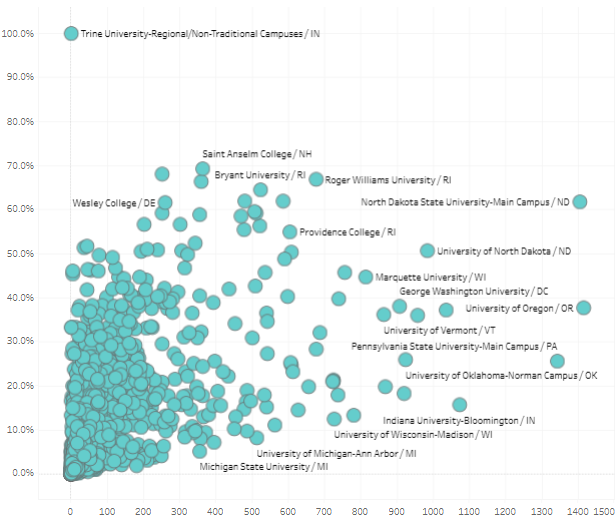
Show Me & Chart Types: Use the Show Me panel to see Tableau’s suggested charts. Try making a stacked bar chart (e.g. Sales by Category stacked by Region)or a combined axis chart (e.g. dual measure on same axis). Note: A combined axis means two measures on the same axis (e.g. overlapping bars) while a dual axis chart has two independent axes (like Sales and Profit dual-axis line chart) – practice both. For a dual-axis, try Sales and Profit over time: drag both to Rows, make dual axis, and ensure they synchronize axes.

Resource: Tableau’s Free Training Videos – Chart Types section can guide you in creating these visuals YouTube tutorials (e.g. “Tableau in 20 Minutes” or specific “How to create [chart] in Tableau” videos) are also helpful. By end of today, you should be comfortable creating basic charts and using marks, color, and labels.
Learn Tableau! Day 6: More Charts – Maps, Tables, and Specialty Charts
Goal: Complete the range of basic chart types in exam scope.
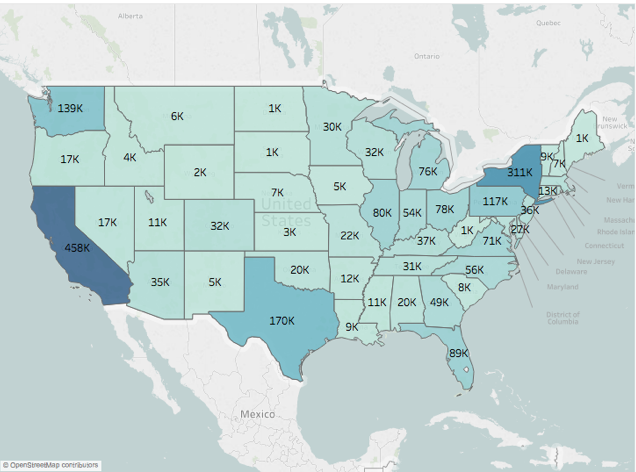
Geographic Map: To learn Tableau, create a map using geographic data. Using Superstore, drag State to Detail (Tableau should automatically generate a map with filled dots), and Sales to Color to create a filled map or symbol map of Sales by State. Ensure you know how to assign geographic roles (if not already set) and how to use Latitude/Longitude generated fields.
Density (Heat) Map: If using Tableau Desktop, try creating a density map (data-density heatmap). This might require a dataset of points; if Superstore is limited, you can understand conceptually that a density map shows concentration of points (often used in mapping) – it’s a less common exam topic, but noted.

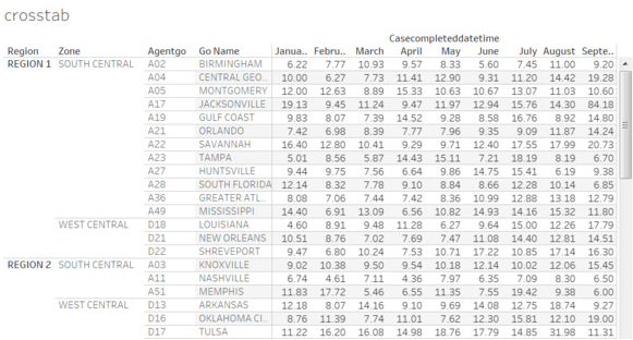
Crosstab & Highlight Table: Make a crosstab (text table) and a highlight table to show specific values.. For a crosstab: put Category and Region on Rows/Columns, Sales on Text to see a table of numbers. Then turn that into a highlight table by adding Color to the Sales (using Square mark type) – this colors the cell by value. These are essentially tables with conditional formatting, useful to know as simple ways to present numbers.
Dual-Axis Chart: If not done on Day 5, create a dual-axis chart (e.g. a bar and line combo or two lines).. For instance, create a dual-axis chart of Sales (bar) and Profit (line) by Month: one measure on Rows as bar, second on Rows as line, then dual axis and synchronize. Understand how to format a dual axis (ensuring both axes use the same scale and the marks can be distinguished).

Resource: To learn Tableau, continue using official videos or a DataCamp course for visual analytics (many courses cover all basic chart types in their early sections). By now you should have created all chart types listed in the exam guide. If any gave you trouble, revisit them and take notes.
Learn Tableau! Day 7: Review & Week 1 Recap
Goal: Solidify week 1 topics and ensure understanding.
Review Key Concepts: Quiz yourself on Domain 1 and 4 basics: What’s the difference between a live connection and an extract? How do you create an extract? When would you use a join vs a relationship? Ask yourself to explain dimensions vs measures, discrete vs continuous (blue vs green), and default aggregation of measures. If you stumble, re-read your notes or the Tableau Help on those topics.
Hands-On Practice: Do a mini-project combining what you learned. For example, build a small dashboard with 2-3 charts from Superstore: maybe a map of Sales by state, a bar chart of Sales by Category, and a line chart of Sales over time. Don’t worry about perfection – this is practice to integrate connecting data, building charts, and simple formatting.
Resource Check: Skim through the official Exam Guide’s exam domains to ensure you touched each item in Domain 1 and the fundamentals of Domain 4. If anything was missed (e.g. .tds file saving, default field properties), practice it now. This is also a good point to read the Visual Analysis Best Practices guide (optional) recommended by Tableau – it can give you tips on effective visualization (and some formatting questions on the exam relate to best practices).
Mock Quiz: Take a short quiz to test your knowledge so far. You can use a free quiz from http://LearningTableau.com (they offer free Desktop Specialist practice quizzes). This will expose you to question formats and help identify any weak areas from Week 1 (don’t worry if you haven’t covered everything yet). Review your answers and understand any mistakes.
Week 2 of How to Learn Tableau: Exploring & Analysing Data Like a Pro


