

Managing inventory effectively requires accurate data and clear visibility across the supply chain. Traditional reports often fail to provide the speed and insights needed to make timely decisions, which is why dashboards have become essential. They combine key performance indicators, visual analytics, and interactive filters to help organizations track stock levels, forecast demand, and control costs. By highlighting patterns in product movement, labour usage, and shipment performance, businesses can respond proactively to challenges. In this article, we explore several inventory management dashboard examples that showcase how data visualization supports smarter decision-making, improves efficiency, and strengthens overall supply chain performance.
Table of Contents
#1 Inventory Management Dashboard
This inventory management dashboard from Jahana Data Solutions provides a comprehensive snapshot of inventory operations and performance metrics. At the top, it features high-level KPIs including total product inventory (1,355 units), inventory value ($2.8M), inventory turnover (70), total hours worked (400), labor cost ($31.4K), and shipping cost ($63.1K). These metrics help stakeholders quickly assess efficiency, stock movement, and operational costs.

The dashboard utilizes a variety of visualizations. A line chart on the left shows the overall trend of requests over time, offering a quick visual summary of request volume fluctuations. A calendar heat map displays daily requests for November, allowing managers to spot patterns in workload. The monthly request bar chart breaks down requests by month and categorises them into “In Stock” and “Out of Stock,” making it easy to identify stock availability issues and trends. Additionally, horizontal bar charts are used to show employee hours (e.g., Anna Andreadi worked 198 hours), top request types (e.g., Repair, Replace device), and most requested products (e.g., WS-C2960L-8PS-LL).
This dashboard would be particularly useful for several roles across the supply chain:
- Inventory managers can monitor stock levels, identify frequently out-of-stock items, and improve replenishment strategies.
- Warehouse managers can view labor distribution and better plan staffing based on request volume.
- Procurement teams can focus on the “most requested products” to streamline purchasing and vendor relationships.
- Operations and logistics personnel can use shipping and labor cost data to control expenses and improve delivery efficiency.
- Executives gain visibility into operational KPIs for strategic planning and resource allocation.
As an inventory management example, this dashboard demonstrates how centralized, visual reporting tools can streamline supply chain decision-making, reduce costs, and improve service levels. It stands out as a practical and effective tool for real-world inventory management.
#2 Inventory Management Dashboard
This inventory management dashboard offers a detailed overview of key operational metrics, helping teams monitor and manage inventory performance efficiently. At the top, it displays critical KPIs including product inventory (1,173 items), inventory value ($2.60M), inventory turnover (66), total labor hours (356), labor cost ($28.04K), and shipping cost ($49.7K). These figures provide a clear snapshot of inventory health and resource allocation, making this a practical inventory management example for organizations with physical goods to track.

The dashboard uses a variety of visualizations to present data effectively. A monthly stacked bar chart displays request volume, broken down by “In Stock” and “Out of Stock” items, helping identify supply gaps over time. Horizontal bar charts are used for “Employee Hours,” “Top Requests,” and “Top Requested Products,” allowing users to instantly see where time and demand are concentrated. For instance, Anna Andreadi logged 180 hours, and the most requested item was WS-C2960L-8PS-LL with 28 requests.
Interactive filter options allow users to slice the data by product category, customer name, item location, and date range. This flexibility supports granular analysis and faster decision-making.
The detailed view table at the bottom adds further context, showing customer names, product types, request types, inventory status, and delivery distances. This makes the dashboard not just high-level, but also operationally actionable.
This inventory management tool would be useful for multiple supply chain roles:
- Inventory managers can use it to monitor stock levels and turnover.
- Procurement teams can identify high-demand products to prioritise purchasing.
- Warehouse managers can optimize workforce planning using employee hours.
- Logistics teams can evaluate delivery distances and shipping costs.
- Executives can track cost metrics and request trends for strategic planning.
Overall, this dashboard is a clear, data-rich inventory management example supporting smarter, faster decisions across the supply chain.
#3 Inventory Management
This inventory management dashboard offers a clear and data-rich view of product performance, sales, and quality across various departments. It is a practical inventory management example that combines operational insights with visual storytelling to support data-driven decision-making in retail or multi-department environments.

Key metrics include Sales ($41,561), Transactions (74,595), Products (4,568), Buyers (386), and Expiring Products (88 this week)—each shown with a mini line chart and year-over-year (YoY) performance trends. These KPIs help managers quickly assess performance compared to the previous year.
The dashboard uses multiple types of visualisations. A bar chart ranks departments by total sales (e.g., Grocery: $31,567, Drug GM: $5,448), giving immediate insight into revenue-driving categories. A scatter plot shows product expiration patterns over time, differentiating between expired, not expired, and expiring this week. This visual is particularly useful for perishable goods or time-sensitive inventory. A horizontal bar chart visualises the percentage of damaged products by department, highlighting where quality issues are most frequent—for example, Cosmetics (27.7%) and Kiosk-Gas (50.6%).
This dashboard would be valuable for several roles across the supply chain:
- Inventory managers can track expiration risks and damaged goods, minimising waste and maintaining stock quality.
- Category managers can assess departmental sales and take action on underperforming segments.
- Procurement teams can use expiration trends to optimize ordering schedules and reduce spoilage.
- Quality control teams benefit from damage percentage data to target root causes.
- Executives can track macro trends across departments and assess YoY growth.
As an inventory management example, this dashboard effectively blends performance, risk, and quality control metrics. Its clean visuals and strategic layout make it a powerful tool for supply chain professionals aiming to balance profitability, product availability, and customer satisfaction.
#4 Inventory – Figma Background
This inventory management dashboard provides a detailed overview of inventory control across multiple categories and warehouses. It is a strong inventory management example that combines real-time metrics, trend analysis, and stock distribution to support effective decision-making throughout the supply chain.
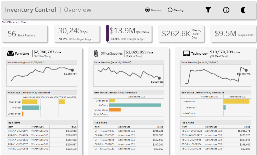
Key summary metrics at the top include:
- 56 Stock Positions
- 30,245 QOH (Quantity on Hand)
- $13.9M QOH Value, with only 19.76% within target range
- $262.6K Missing Stock Cost
- $9.5M Surplus Cost
These figures highlight stock performance, shortages, overages, and financial implications, giving stakeholders a holistic view of inventory health.
The dashboard is broken down by category—Furniture, Office Supplies, and Technology—with each section showing total value, trending value over time (line chart), stock status distribution by warehouse (stacked bar charts), and the top 5 high-value items (tables). For example, Technology accounts for $10.57M (76.3% of total inventory value), with significant overstock observed in Warehouse 003.
Chart types include:
- Line charts for inventory value trends
- Stacked bar charts showing overstock, at-stock, under-stock, and out-of-stock status by warehouse
- Tables listing the top items by value and location
This dashboard is especially useful for:
- Inventory managers, who need to balance stock across locations and reduce surplus/missing inventory
- Warehouse managers, who can identify which facilities are over- or under-stocked
- Procurement teams, who can adjust purchasing based on current stock and consumption trends
- Finance teams, who monitor the financial impact of excess or missing inventory
- Executives, who gain a strategic view of overall inventory control and performance
As an inventory management example, this dashboard excels in presenting actionable insights through intuitive visuals, enabling supply chain teams to reduce costs, minimize stockouts, and optimize stock allocation across the enterprise.
#5 Supply Chain: Inventory Management Analysis
This inventory management dashboard provides a comprehensive view of supply chain performance, tracking key metrics across time, geography, product lines, and future projections. It’s an excellent inventory management example for businesses looking to balance inventory levels with sales demand across the U.S.

The top section highlights Inventory Growth YoY, displaying five major metrics: Inventory Weeks on Hand, Inventory Units, Inventory Value, Sales Units, and Sales Value. Each metric is shown with year-over-year percentage change and a mini line chart, allowing quick insight into positive or negative trends—e.g., inventory value is up by 327.80%, while sales units are down by 2.29%.
Various types of charts are used to visualise the data:
- A line and bar combo chart in “Inventory on Hand” shows inventory volume trends over time.
- A map visualization (“Inventory by State”) uses color-coding to highlight states with inventory levels either in or out of range based on custom thresholds.
- Another line and bar chart compares projected sales against inventory to help answer: “Can inventory meet projected demand?”
- The dot matrix chart under “Product Inventory” gives a granular view of inventory by product family and SKU.
- A bar chart for “Upcoming Shipments” displays scheduled deliveries by month, product, and quantity.
This dashboard would benefit multiple roles in the supply chain:
- Inventory managers can track stock levels and identify over- or under-stocked regions or SKUs.
- Demand planners can align shipments with forecasted sales and avoid stockouts or surplus.
- Procurement teams use it to prioritise purchase orders based on upcoming needs.
- Executives and finance teams monitor value-based performance and cost-efficiency.
In summary, this inventory management dashboard delivers powerful insights through clear, interactive visuals. It’s a prime inventory management example of how businesses can drive smarter, data-backed decisions in real time.
A well-designed dashboard can transform the way organizations handle inventory, providing real-time insights that reduce waste, optimize stock allocation, and improve profitability. The ability to track performance by category, geography, or time period makes these tools valuable to warehouse managers, procurement teams, and executives alike. As shown in the inventory management dashboard examples, these solutions help companies align supply with demand while controlling labor and logistics costs. Ultimately, dashboards serve not just as monitoring tools but as strategic assets, enabling businesses to remain agile, competitive, and resilient in today’s fast-paced supply chain landscape.