Learn Tableau from Zero to Certified: The Ultimate 4-Week Beginner Plan- Week 1
Focus: This week dives deeper into data exploration and analysis (Domain 2) in Tableau. If you’re looking for how to learn Tableau, you’ll explore how to organise data using grouping and filtering, and apply analytic features like sorts, calculations, and totals. By the end of Week 2, you’ll have covered the largest exam domain (Exploring & Analysing Data, ~37% of the exam), and you’ll be comfortable creating various charts and deriving insights from them.
Table of Contents
How to Learn Tableau – Day 8: Grouping, Sets, and Hierarchies
Goal: Learn to organise and segment data in Tableau.
Groups: Create a group to combine categories. For example, in a bar chart of Sales by Sub-Category, group several sub-categories into a new “Other” category (ctrl-select marks or use the paperclip icon). This tests the skill of grouping using marks or the data pane.

Sets: Create a set to isolate a subset of data. For instance, create a set of the top 10 customers by Sales (you can do this by right-clicking ‘Customer Name’ and selecting ‘Create Set’, then setting the condition to ‘Top 10 by Sales’).
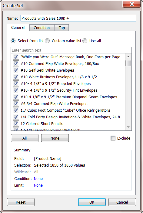
Also, try a visual set by selecting marks (e.g. select the top 5 bars in a chart and choose “Create Set”). Understand the concept: sets are custom fields that define a subset of data, and can be used to filter or colour marks.

Hierarchies: Organise dimensions into a hierarchy. In Superstore, you could create a hierarchy for Category > Sub-Category (drag one onto another in the Data pane).
This allows for drill-down in a visualisation (e.g., clicking + to expand a Category into its Sub-Category in a chart). Ensure you know how to create and use hierarchies to drill into data.
How to Learn Tableau – Day 9: Filtering Data
Goal: Master filtering in Tableau.
Basic Filters: Add filters to your views to refine the data. In a chart (e.g. Sales by Category), drag Category to the Filters shelf and keep only one category to see the effect.

Practice both dimension filters (categorical filters) and measure filters (e.g. filter to Sales > 1000).

Date Filters: Work with date filters specifically. Drag Order Date to Filters – you’ll see options to filter on ranges or discrete date parts. Practice filtering to a specific date range (e.g., only years 2018-2019) and alternatively filtering on a relative date (e.g., last N years). Understand the difference between continuous date filters (range of dates) and discrete date part filters (e.g. only “February” across years).

Filter Options: On any filter, use options such as Wildcard (for text contains), Top N (e.g., show top 10 by Sales, which effectively creates a set under the hood), and Condition tabs. Also, practice showing filters to users: in a dashboard or worksheet, use Show Filter to display a filter card and try different filter UI (dropdown, slider, etc.).
Order of Operations (FYI): Tableau has a filtering order (cascade of context, dimension, measure, etc.), but for the Specialist exam, in-depth knowledge of context filters isn’t heavily tested. Please note that context filters are processed before other filters (in the case of a complex question).
Resource: Tableau’s “Filtering” how-to video or Knowledge Base articles on quick filters. Many exam questions expect you to know how to add or adjust a filter (e.g. “How do you filter a view to the last 7 days?”). Hands-on practice is the best way to remember these.
How to Learn Tableau – Day 10: Sorting & Totals
Goal: Learn to sort data and display totals in views.
Sorting: Create a view (e.g. a bar chart of Sales by Sub-Category) and practice both manual and computed sorting. Try sorting by clicking the sort icon on an axis (computed sort by measure), and also manually sorting (dragging items or using the sort dialogue to specify a field). Know how to sort alphabetically vs by a measure. The exam may ask how to sort or what a given sort icon does.

Totals and Subtotals: Practice showing row/column totals. For a table or chart with multiple dimensions (e.g. Sales by Category and Region), use the Analytics pane or Worksheet menu to “Show Row Grand Totals” and “Show Column Grand Totals.” Also, enable subtotals if applicable (Analysis -> Totals -> Add All Subtotals). Check that you understand how totals aggregate (e.g. they sum up categories).
Reference Lines: Add a reference line to a chart. For example, in a Sales by Month line chart, add a reference line for average Sales (Analytics pane -> drag Reference Line into table or cell). Set it to average and label it accordingly. Reference lines can also be added per cell or pane – just be aware of how to create a simple one and that they can display features such as averages or targets.

Formatting Tip: Format your reference line (dashed, colour) and totals (maybe bold them) to distinguish them. While practising, also recall Domain 3 formatting skills (you’ll dive deeper into them in Week 3, but there’s no harm in practising early): e.g., changing a mark colour, customising a tooltip, etc.
Resource: Tableau’s official help on Sorting and Reference Lines (Product Help or free videos) can supplement your hands-on practice. Sorting and reference lines are straightforward once done a couple of times.
How to Learn Tableau – Day 11: Quick Table Calculations & Bins/Histograms
Goal: Use Tableau’s one-click analytics features.
Quick Table Calculations: Tableau provides built-in calculations, such as running totals and percentage of total. Create a view (e.g., Sales by Month) and apply a Quick Table Calculation. For example, right-click Sales pill -> Quick Table Calculation -> Year-to-Date Total or Percent of Total. See how the numbers change. Also, try Moving Average or Rank. Understand that quick table calculations are applied after aggregation and provide a fast way to perform standard calculations without needing to write formulas. The exam may ask how to create a running total – answer: using a quick table calculation is one way.
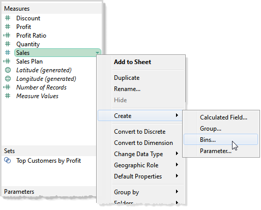
Bins & Histogram: Create bins on a measure and build a histogram. For instance, create bins on Sales (right-click Sales in Data pane -> Create -> Bins, set bin size, e.g. 500). Tableau will create a new dimension (e.g. Sales (bin)). Drag that to Columns and maybe Count of Records to Rows to get a histogram of order counts by Sales range. This covers creating a histogram and using measure bins – know that bins turn a continuous measure into discrete buckets.
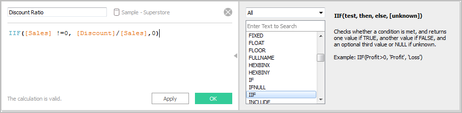
Calculated Field (Basics): Create a basic calculated field. For example, create a calculated field for Profit Ratio = SUM(Profit)/SUM(Sales) or a simple string calculation, such as concatenating the customer name and segment. Or create a date calculation like the year of the Order Date (though Tableau has built-in date parts). The goal is to learn how to perform calculations and understand basic syntax (e.g., SUM(), arithmetic operations, etc.). The exam may include a simple calculation or ask for the result of a specific calculation.
When to Use a Parameter: Think about parameters conceptually. Create a simple parameter to see how it works: e.g. a parameter for Discount Rate (a percentage) and a calculated field that applies this discount to Sales. Or a parameter that lets a user choose a measure to display (using a calculated field with a CASE or IF for different measures). While building one is a bit advanced, at least understand that parameters are user-defined dynamic values that you can use in calculations or filters (e.g., a parameter allows user input, as an exam might ask something like “What is a parameter used for?”).

Resource: Tableau’s “Creating Calculated Fields” video, and tutorials on building a histogram if needed. Many third-party blogs (e.g. Tableau Tip blogs) have step-by-step guides for histograms and table calculations. These days’ topics are vital for analysis – ensure you practice and understand each.
How to Learn Tableau – Day 12: Practice Analytical Questions
Goal: Reinforce Domain 2 knowledge with targeted practice.
Apply What You Learned: Pose some fundamental questions and use Tableau to answer them. For example: “Which products are the most profitable?” – use a bar chart or sorted table with Profit. “What is the monthly sales trend and how does it compare year-over-year?” – create a dual-axis line chart of this year vs last year sales (this involves a table calc or using measure values). “What per cent of total sales does each region contribute?” – Use a pie chart or a bar chart with quick table calculations, showing percentage of total. By trying to answer questions, you’ll use multiple features together (filters, calculations, etc.), which simulates exam scenarios.
Mini-Challenge: Take a Tableau Public “Makeover Monday” dataset or any small dataset of interest, and build a few charts from scratch. This is optional but great for extra practice – it forces you to connect to a new data source and quickly explore it (just like an exam scenario might describe a view).
Review Parameter Use: If parameters are tricky, read a blog or watch a video on a simple parameter use case (e.g., parameter-driven filter or chart swap). You don’t need to master complex parameter actions for this exam; grasp the idea that parameters allow user input that isn’t tied to the data source.
Knowledge Check: Go through the Domain 2 objectives list and tick off what you’ve done: created each chart type, grouped, set, filtered, sorted, etc. If anything is missing or still uncertain, use today to fill that gap with practice.
Quiz: Take another practice quiz focusing on visualisation and analysis questions. Many free quizzes or flashcards are available (search for “Tableau Desktop Specialist free quiz Domain 2”). This will test your recall on things like “How to create a group”, “Which chart is best to show contribution to total”, or interpreting a quick table calculation result.
How to Learn Tableau – Day 13: Midpoint Practice Exam
Goal: Simulate exam conditions on what you’ve learned so far.
Timed Practice: Attempt a half-length practice exam (20 questions in ~30 minutes). You can use http://LearningTableau.com ’s free quizzes (take multiple to sum ~20 questions) or any Tableau Specialist mock exam you can find. Treat it seriously: set a timer for 30 minutes and work without interruption to simulate exam timing (about 1.5 minutes per question).
Review Results: Go through the answers, especially any you got wrong or guessed. Use the detailed solutions if available (e.g. learningtableau.com provides explanations ). Make notes on why the correct answer is correct – was it a knowledge fact you didn’t know (e.g. “what file type saves data source info” = .TDS) or a skill you need to practice (e.g. creating a dual-axis chart)? This will guide where to focus in the coming days.
Strengthen Weak Areas: If the practice exam exposed weak spots (say you missed a question on hierarchies or discrete vs continuous dates), revisit those topics now. Re-read the relevant Tableau documentation or do a quick targeted exercise in Tableau to reinforce the concept.
Confidence Check: At this stage (mid-study), you should be comfortable with data connections and the majority of visualisation tasks. If you feel behind, consider adjusting the plan by spending extra time this weekend to catch up (e.g., redo some official training videos or seek help from the Tableau Community forums on any issues). It’s okay – better to address it now than last minute.
How to Learn Tableau – Day 14: Rest or Catch-up
It’s essential to have a little buffer.
Use today to rest, absorb what you’ve learned, or catch up on any tasks you missed. If you’re on track, give yourself a break or lightly review your flashcards and notes. If you skipped any exercises or resources earlier, use this time to do them.