A CFO dashboard is an indispensable tool for financial leaders to monitor key financial metrics, streamline decision-making, and maintain financial health across the organisation. From income statements and balance sheets to cash flow analysis and audit compliance, CFO dashboard examples provide explicit, visual representations of critical data. These visuals enable CFOS to quickly identify trends, assess risks, and optimise financial strategies effectively. In this blog post, we showcase 11 impactful CFO dashboard examples that demonstrate how financial leaders can leverage visual data analytics to enhance operational efficiency, manage risks, and drive strategic growth.
Table of Contents
#1 CFO Dashboard – Revenue & Profit KPI Dashboard
This compelling CFO dashboard example provides a comprehensive overview of profit metrics across multiple timeframes, utilising various visualisations for practical financial analysis. At the top, a date selector enables filtering by order date, state, segment, and category, allowing the CFO to customise the data view.
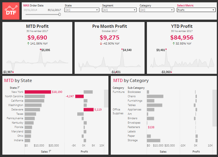
The top row presents three key KPIS:
- MTD Profit (Month-to-Date) for November 2017 is $9,690, representing a 141.56% year-over-year increase. A sparkline highlights the profit trend, with notable highs and lows marked.
- Pre-Month Profit for October 2017 shows $9,275, a 42.90% decline year over year, with a sparkline capturing fluctuations in profitability.
- YTD Profit (Year-to-Date) through November 30, 2017, is $84,956, a 32.93% increase YoY, as depicted by a trendline.
The bottom row features two segmented bar charts:
- MTD by State presents a horizontal bar chart showing sales per state, with corresponding profit bars indicating performance variances. New York leads with $18,190 in sales, while North Carolina incurs a $4,247 loss.
- MTD by Category breaks down performance by sub-category under Furniture and Office Supplies, highlighting sales and profit metrics.
This CFO dashboard enables financial leaders to pinpoint regional and category-specific profit drivers, assess month-over-month and year-over-year performance, and implement targeted financial strategies to optimise profitability.
#2 CFO Dashboard – Quarterly Cashflow
This CFO dashboard, a prime CFO dashboard example, provides a comprehensive view of quarterly cash flow, focusing on credit and debit transactions. The top section features a header displaying the current balance of $66,156,733 and a dropdown to select the reporting quarter, making it an effective CFO dashboard for monitoring financial periods.
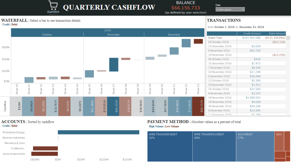
A prominent Waterfall Chart visualises cash flow from Week 40 to Week 53, illustrating the buildup of cash inflows (blue) and outflows (brown). Each bar is labelled with transaction amounts, allowing the CFO to pinpoint critical cash flow weeks and assess cash movement trends effectively.
On the right, a Transaction Table details credit and debit amounts from October 1 to December 31, 2016. The table concludes with a total of $197,492,588 in credits and ($131,335,855) in debits, providing a detailed snapshot of quarterly cash movement, reinforcing the CFO dashboard’s value for financial tracking.
The Accounts Section below ranks top accounts by cash flow, with horizontal bars segmented by credit and debit. Prometheo Energy leads with the largest cash inflow, while Janus Investments records a significant outflow, showcasing how the CFO dashboard highlights major financial contributors.
At the bottom, a Payment Method Treemap visualises payment methods as a percentage of total cash flow. Wire Transfer Debit accounts for 32%, Wire Transfer Credit for 30%, and ACH Credit for 27%, emphasising the CFO dashboard’s ability to categorise cash flow by payment method for strategic insights.
#3 CFO Dashboard – Budget Budget Overview Dashboard
The CFO Dashboard is a comprehensive financial performance monitoring tool that provides key insights into budget versus actual spending. The dashboard is divided into two primary sections: Month-to-Date (MTD) and Year-to-Date (YTD) financial performance, each showcasing bar charts with exact figures and budget targets. Notable visual indicators include colored bars highlighting budget variances, with red indicating budget overruns.
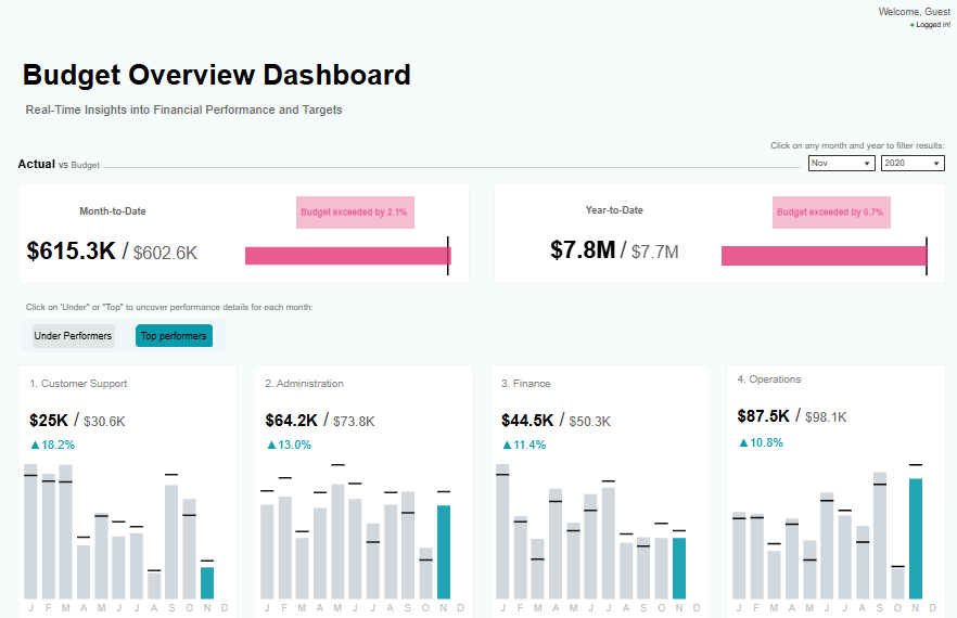
Below the MTD and YTD metrics, the dashboard presents departmental performance data segmented by Customer Support, Administration, Finance, and Operations. Each department’s performance is visualised through bar charts representing monthly actual spending against budget targets. Positive and negative variances are indicated with percentage changes and colour-coded markers.
CFOS can leverage this dashboard to assess financial health quickly, identify underperforming or overperforming departments, and monitor budget adherence over time. By analysing spending trends and variance percentages, CFOS can make informed decisions regarding budget reallocations, cost controls, and financial forecasting. Additionally, the interactive functionality allows for filtering by month and year, enabling targeted analysis and timely intervention in response to budget deviations.
#4 CFO Dashboard – Profit & Loss Statement
This compelling CFO dashboard example presents a comprehensive Profit and Loss Statement for the year through June 2017. The dashboard is structured to deliver a clear breakdown of financial performance across key income and expense categories, making it an essential tool for economic analysis.
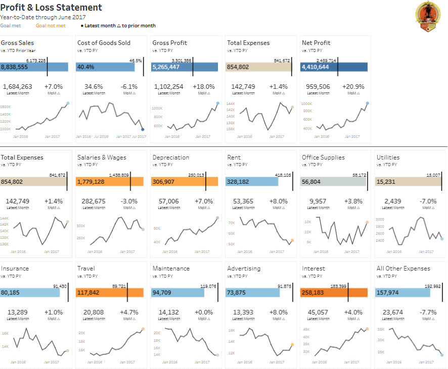
The top row highlights critical financial metrics, including Gross Sales, Cost of Goods Sold, Gross Profit, Total Expenses, and Net Profit. Each metric is represented with a horizontal bar chart showing year-to-date (YTD) values against prior year (PY) figures, accompanied by a percentage variance. Below each bar, a line chart visualises monthly trends, enabling the CFO to identify patterns and assess performance fluctuations effectively.
The middle and bottom sections of this CFO dashboard further divide expenses into detailed categories such as Salaries and wages, Depreciation, Rent, Office Supplies, Utilities, Insurance, Travel, Maintenance, Advertising, Interest, and All Other Expenses. Each category includes a bar chart comparing current YTD values to the previous year and a line chart illustrating month-over-month trends, making it a comprehensive CFO dashboard example.
For instance, Rent shows a YTD value of $328,182, a 7% increase over the prior year, while Utilities have decreased by 7% to $15,231. This CFO dashboard enables financial leaders to monitor expense trends, assess cost drivers, and implement strategic financial planning for improved profitability.
#5 CFO Dashboard – Accounts Payable Dashboard
This CFO dashboard, a prime CFO dashboard example, provides a comprehensive overview of accounts payable, emphasising outstanding amounts, overdue invoices, and payment processing efficiency. The top left section visualises the Total Outstanding Amount with bar charts categorised by payment status: $175K on time (32% of total), $76K late by 1-30 days, and $256K overdue by over 120 days, representing 46% of the total outstanding.
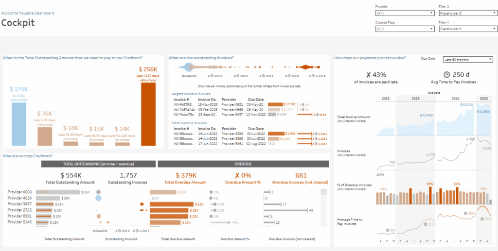
The top centre section features a Scatter Plot displaying outstanding invoices by due date, with each circle representing an invoice. Larger circles indicate higher amounts, and the position reflects the days past due. A detailed table below lists the most significant and overdue invoices, identifying key creditors and due dates, reinforcing this CFO dashboard’s effectiveness for financial tracking.
In the bottom left section, the Top Creditors Analysis bar chart ranks providers by total outstanding amounts, showing both on-time and overdue balances. Provider 0658 and Provider 4516 hold the largest outstanding balances, highlighting significant overdue amounts, a crucial insight for this CFO dashboard example.
The right section of the CFO dashboard delivers a comprehensive analysis of the payment process over the last 60 months, including a line chart for invoice trends, a bar chart for overdue percentages, and a line graph for the average days to pay invoices (250 days). This offers critical data for cash flow optimisation and payment management.
#6 CFO Dashboard – Accounts Receivable
This impactful CFO dashboard example provides a comprehensive view of accounts receivable, focusing on outstanding amounts, debtor reliability, and expected cash collection. The top section summarises key metrics: $1.09M Outstanding and $359K Overdue as of August 1, 2023.
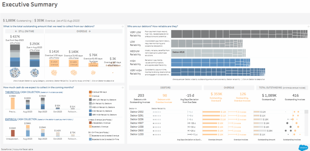
The left section visualises the Total Outstanding Amount with bar charts segmented by payment status: $437K still on time, $293K due in August, and $76K overdue by 61-90 days. A dot plot below shows each debtor by aging category and reliability, enabling the CFO to identify high-risk debtors quickly.
The centre section features a Debtor Reliability Analysis with a treemap that segments debtors by payment history. Debtors are classified as Very Low, Low, Medium, High, and Very High reliability, with larger squares representing larger outstanding amounts. This visual provides a clear assessment of debtor risk and prioritises collections.
On the right, the Debtors and Overdue Analysis section lists 203 debtors with outstanding invoices, 98 of which are overdue. A bar chart breaks down overdue amounts and days past due, allowing the CFO to focus on the most significant and most overdue invoices.
The bottom section includes two cash flow projections: Theoretical Cash Collection based on due dates and Empirical Cash Collection based on payment patterns. This CFO dashboard equips financial leaders to manage collections effectively, identify high-risk debtors, and project future cash inflows accurately.
#7 CFO Dashboard – Expenses Audit Dashboard
This CFO dashboard, a crucial CFO dashboard example, provides an in-depth overview of expense management, focusing on departmental spending, employee expenses, and potential duplicate payments. The top section highlights three key metrics: Total Amount (£517.1K), Average Amount (£104.35), and Number of Expenses (4,955). Each metric is paired with a line chart comparing 2021 to 2020, effectively illustrating percentage changes and expense trends within this CFO dashboard.
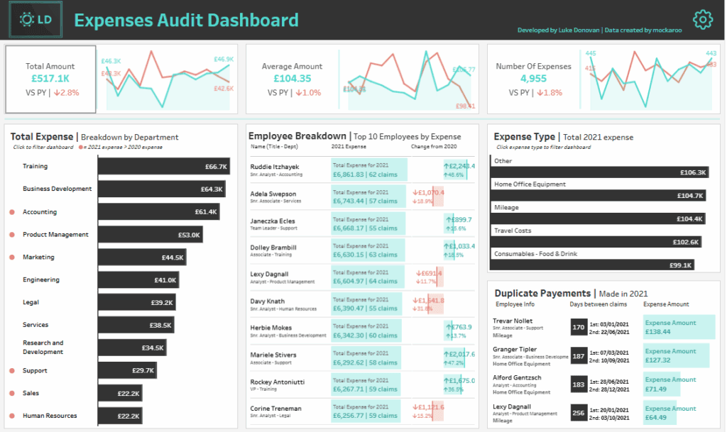
On the left, the Total Expense Breakdown by Department bar chart ranks departments based on spending, with Training, Business Development, and Accounting being the top spenders. The bar lengths convey expense magnitude, allowing the CFO to pinpoint cost-intensive areas in this CFO dashboard example quickly.
The centre section features the Employee Breakdown, listing the top 10 employees by expense. Each employee’s total cost for 2021 is shown alongside the number of claims and the change from the prior year, offering actionable insights into individual spending behaviour, reinforcing the value of this CFO dashboard.
On the right, the Expense Type Analysis displays the top five expense categories, including Home Office Equipment and Mileage, with corresponding amounts. Below, the Duplicate Payments section highlights potential duplicate claims, detailing employee information, expense types, and dates for further investigation.
This CFO dashboard enables financial leaders to track expense trends, identify high-cost areas, and implement targeted cost-control measures through effective expense auditing and monitoring.
#8 CFO Dashboard – Income Statement
This CFO dashboard, a comprehensive CFO dashboard example, provides a detailed analysis of the income statement for 2021-2022, focusing on key financial metrics such as revenue, gross margin, operating income, and net income. The top left section features bar charts for each metric, displaying monthly data and comparing current performance against the prior year. Blue bars indicate better performance, while red bars highlight declines, enabling the CFO to assess monthly trends within the CFO dashboard quickly.
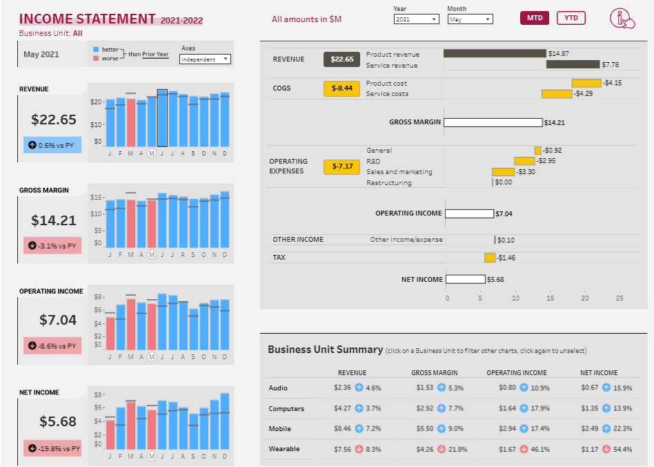
The centre section presents a detailed Income Statement Breakdown with horizontal bar charts for Revenue, Cost of Goods Sold (COGS), Operating Expenses, and Net Income. Each category is subdivided into specific expense types such as product costs, service costs, and R&D, visually represented by yellow bars to indicate significant variances. This structured view in the CFO dashboard helps identify key cost drivers and effectively assess their impact on profitability.
On the right, the Business Unit Summary provides a segmented view of financial performance across product lines—audio, Computers, Mobile, and Wearable. Each segment includes revenue, gross margin, operating income, net income, and percentage changes, making it a valuable CFO dashboard example for analysing business unit profitability and identifying cost optimisation opportunities.
This CFO dashboard empowers financial leaders to monitor income statement trends, pinpoint expense variances, and implement targeted financial strategies to improve profitability and control operating costs effectively.
#9 CFO Dashboard – Balance Sheet
This crucial CFO dashboard example provides a comprehensive view of the balance sheet for December 2023, offering an in-depth analysis of assets, liabilities, and equity. The left section presents a Current Assets and Liabilities Analysis, utilising bar charts to compare $16.0M in current assets and $12.6M in current liabilities. A working capital figure of $3.4M is displayed alongside a current ratio of 1.27, effectively indicating liquidity status and operational efficiency within this CFO dashboard.
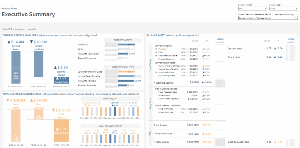
The center section of this CFO dashboard breaks down Current Assets and Liabilities using horizontal bar charts, detailing categories such as Inventory, Cash, Accounts Receivable, and Prepaid Expenses. Each category is accompanied by a percentage change from the previous month, enabling financial leaders to track economic trends and assess potential areas of concern.
The Balance Sheet Summary on the right provides a detailed breakdown of short-term and long-term assets and liabilities, with line graphs tracking changes over the last 12 months. Key metrics such as the Current Ratio (1.27) and Quick Ratio (0.62) are highlighted, allowing financial leaders to assess liquidity and solvency quickly.
The bottom section includes a Debt-to-Asset Ratio Analysis, visualised with bar charts. It shows a ratio of 0.31, reflecting a slight increase over the previous month.
This CFO dashboard enables financial leaders to effectively monitor liquidity, assess asset and liability trends, and make strategic financial decisions to maintain economic stability.
#10 CFO Dashboard – Ratio Analysis
This CFO dashboard, a comprehensive CFO dashboard example, provides a financial overview that includes key performance metrics, income statement analysis, balance sheet summary, and financial ratios. The left section presents Key Performance Metrics such as Total Revenue ($47,114K, down 1.54% YoY), Gross Margin ($14,526K, down 0.06% YoY), Net Income ($11,609K, up 0.57% YoY), Total Debt ($7,836K, down 7.77% YoY), and Working Capital ($429K, down 41.18% YoY). Each metric is accompanied by a bar chart visualising monthly trends and percentage changes, making it a powerful CFO dashboard for tracking performance.
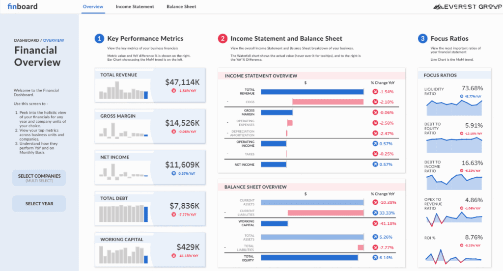
The center section features the Income Statement Overview, a horizontal waterfall chart. It breaks down revenue, COGS, operating expenses, depreciation, and net income, with each bar reflecting dollar values and percentage changes. This CFO dashboard structure enables financial leaders to assess the organisation’s financial health and pinpoint key cost drivers effectively.
Below the income statement, the Balance Sheet Overview presents asset and liability breakdowns, working capital, and equity levels, allowing the CFO to evaluate liquidity and leverage comprehensively within this CFO dashboard example.
The right section includes Focus Ratios, such as the Liquidity Ratio (73.68%), the Debt-to-Equity Ratio (5.91%), and the ROI (8.76%), each visualised as a line chart to track month-over-month trends.
This CFO dashboard enables financial leaders to monitor financial performance, assess profitability, and identify financial risks through targeted ratio analysis and visual insights.
#11 CFO Dashboard – Audit
This strategic CFO dashboard example provides a comprehensive overview of audit results, focusing on compliance rates, issues found, financial savings, and customer satisfaction. The top section presents key performance indicators: 143 Companies Audited, 745 Issues Found, 390 Issues Rectified, $20,581 Saved, and a Satisfaction Score of 5.7/10. These metrics within the CFO dashboard are essential for evaluating overall audit effectiveness and financial impact.
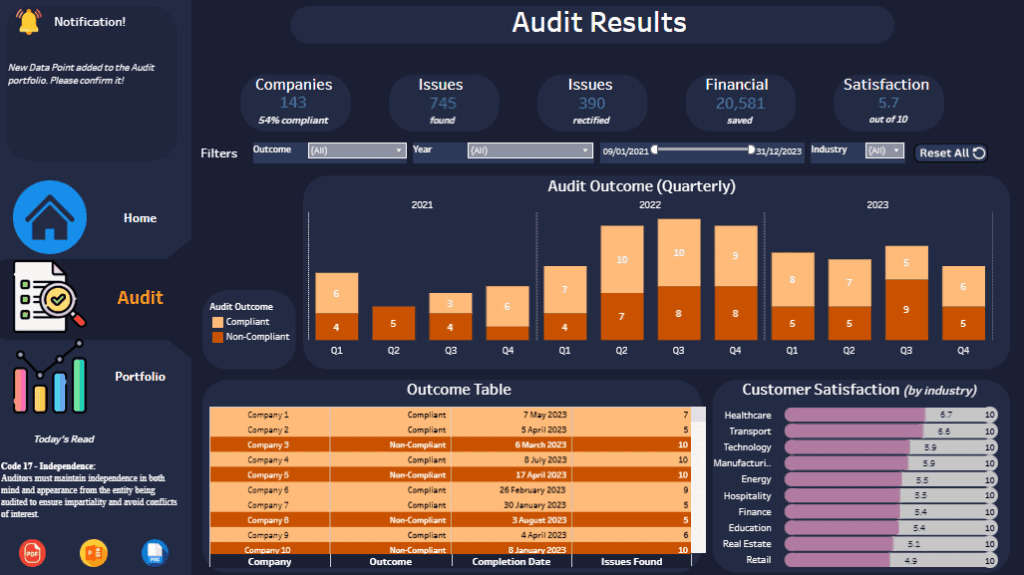
The centre section features a Quarterly Audit Outcome Bar Chart, displaying compliance and non-compliance trends across 2021, 2022, and 2023. Each quarter is represented by stacked bars, with compliant outcomes in light orange and non-compliant outcomes in dark orange. This CFO dashboard visualisation enables the CFO to monitor quarterly compliance trends and assess audit performance effectively.
Below the bar chart, the Outcome Table provides a breakdown of companies audited, their compliance status, completion dates, and the number of issues identified. This section of the CFO dashboard helps financial leaders pinpoint high-risk entities and track audit progress efficiently.
The Customer Satisfaction Analysis is visualised on the right as a horizontal bar chart segmented by industry. It shows satisfaction scores across sectors like Healthcare, Technology, and Retail, enhancing the CFO dashboard’s ability to analyse customer feedback comprehensively.
This CFO dashboard empowers financial leaders to assess audit outcomes, track issue resolution, identify non-compliant entities, and monitor customer satisfaction trends, supporting strategic risk management and financial decision-making.
A well-designed CFO dashboard transforms complex financial data into actionable insights, empowering financial leaders to confidently make data-driven decisions. The 11 CFO dashboard examples featured in this post illustrate how powerful data visualisation can simplify financial analysis, monitor KPIS, and provide a comprehensive overview of a company’s financial health. Whether tracking revenue trends, managing cash flow, or monitoring compliance, these CFO dashboards are essential for maintaining financial stability and supporting strategic decision-making. Implementing targeted CFO dashboards allows financial leaders to navigate evolving business challenges effectively, optimise financial performance, and achieve sustainable growth.